
Blue Kitchen Cabinets: 14 ideal Ideas to Transform Your Kitchen

Blue kitchen cabinets have moved well beyond a passing trend. Interior designers and homeowners alike now recognize blue as one of the most versatile, emotionally resonant colors you can bring into the heart of the home. Whether you prefer a deep, commanding navy or a breezy coastal powder blue, there is a shade and a styling approach that fits your space, your personality, and your budget.
Blue Kitchen Cabinets Ideas combine color, storage, and modern kitchen styling in one design feature. These cabinets add depth, elegance, and personality to cooking spaces. Different blue shades improve brightness, create balance, and match easily with wood, marble, quartz, and modern kitchen hardware for timeless appeal.
Blue Kitchen Cabinets bring warmth, sophistication, and visual contrast into modern kitchens through rich navy, powder blue, or soft coastal shades. These stylish cabinets improve kitchen atmosphere, support versatile design combinations, and create a clean, welcoming space that feels elegant, practical, and comfortable for everyday family living.
Blue Kitchen Cabinets Ideas include two-tone layouts, gold hardware, open shelving, and bright countertops. Navy shades create bold contrast. Powder blue adds softness and lightness. Proper lighting enhances cabinet color and texture. Smart styling choices keep kitchens functional, organized, stylish, and visually balanced for long-term design satisfaction.
Navy Blue Kitchen Cabinets:
The Timeless Classic That Never Fades
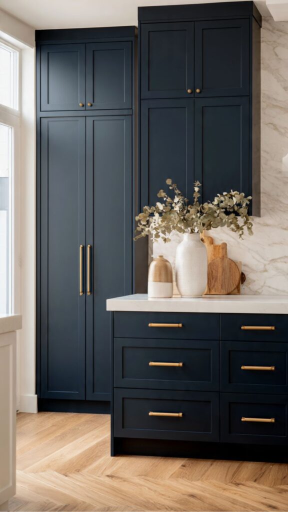
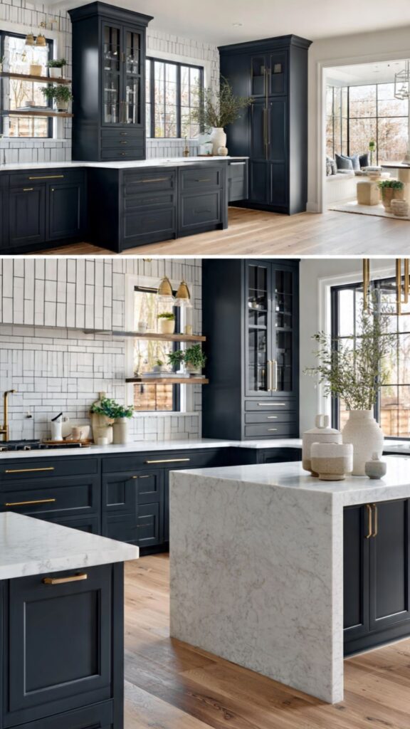
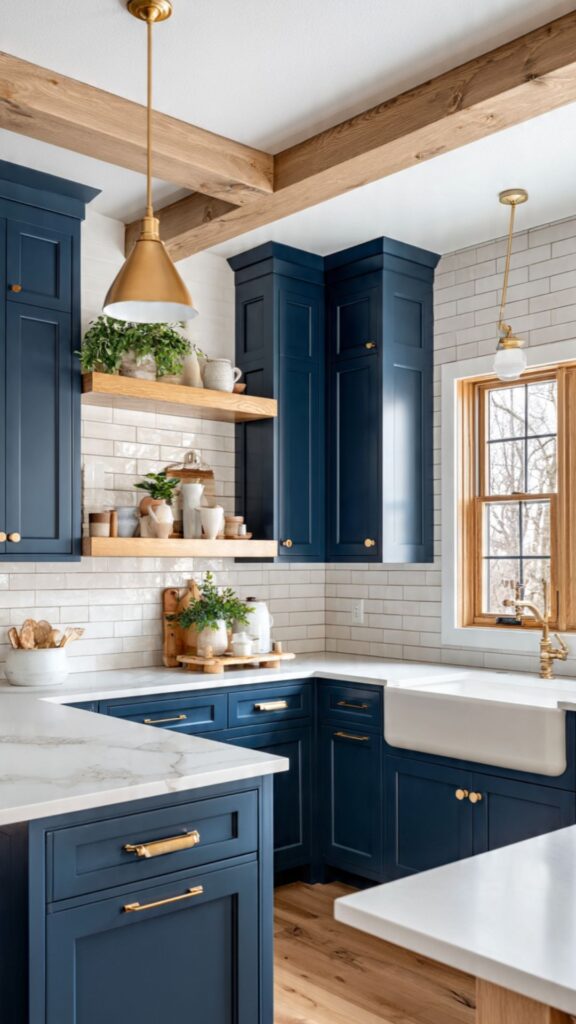
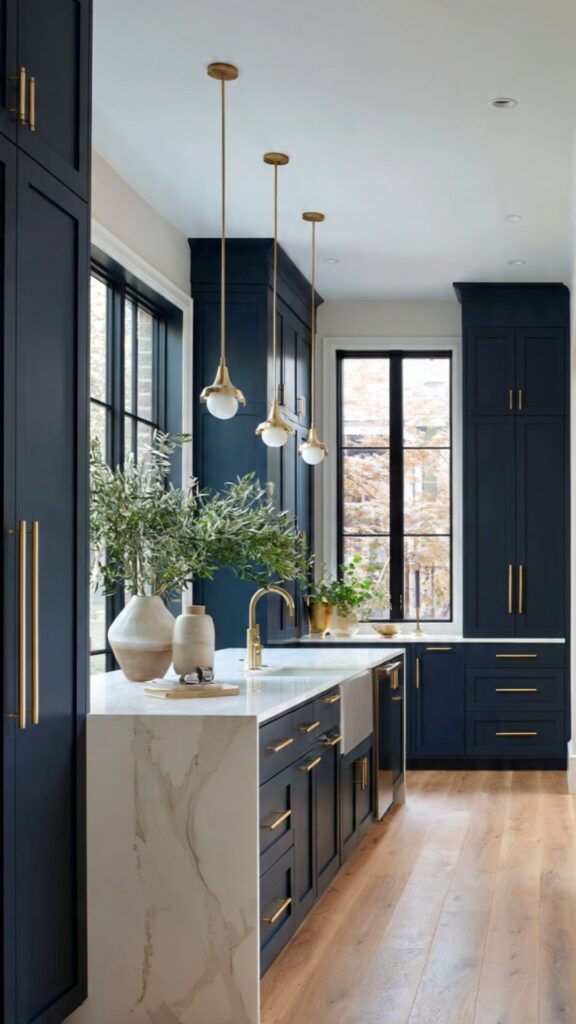
Navy blue kitchen cabinets are arguably the most dependable choice in the entire blue spectrum. The shade sits at the intersection of dramatic and sophisticated dark enough to make a statement, but anchored enough to avoid feeling trendy or unstable.
Designers routinely recommend navy as the “safe bold” color: it photographs beautifully, appeals to a wide range of buyers if you ever sell, and remains timeless across both traditional and contemporary kitchen styles. One often-overlooked insight about navy cabinets is the importance of sheen level. A flat or matte finish navy cabinet reads as very modern and architectural, ideal for handleless, slab-door kitchens with minimal visual clutter.
A satin or semi-gloss navy cabinet, however, picks up light in a way that brings warmth and depth to more traditional Shaker-style doors. Choosing the wrong finish for your style can make navy look flat and dull or unexpectedly flashy so this decision deserves careful consideration before ordering samples.
Navy also performs especially well in kitchens with natural wood accents. Picture navy lower cabinets paired with open walnut shelves above and a white quartz countertop this three-way combination creates a layered, lived-in richness that no all-white kitchen can match.
For those worried navy might make a kitchen feel cave-like, the solution is simple: reserve the navy for base cabinets only, use white or cream for uppers, and ensure your lighting plan includes under-cabinet LED strips to banish any shadows at the countertop level.
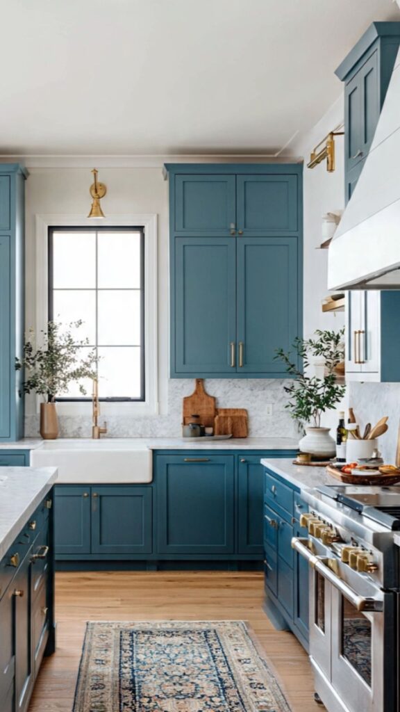
Powder Blue Kitchen Cabinets:
Soft, Airy & Effortlessly Elegant
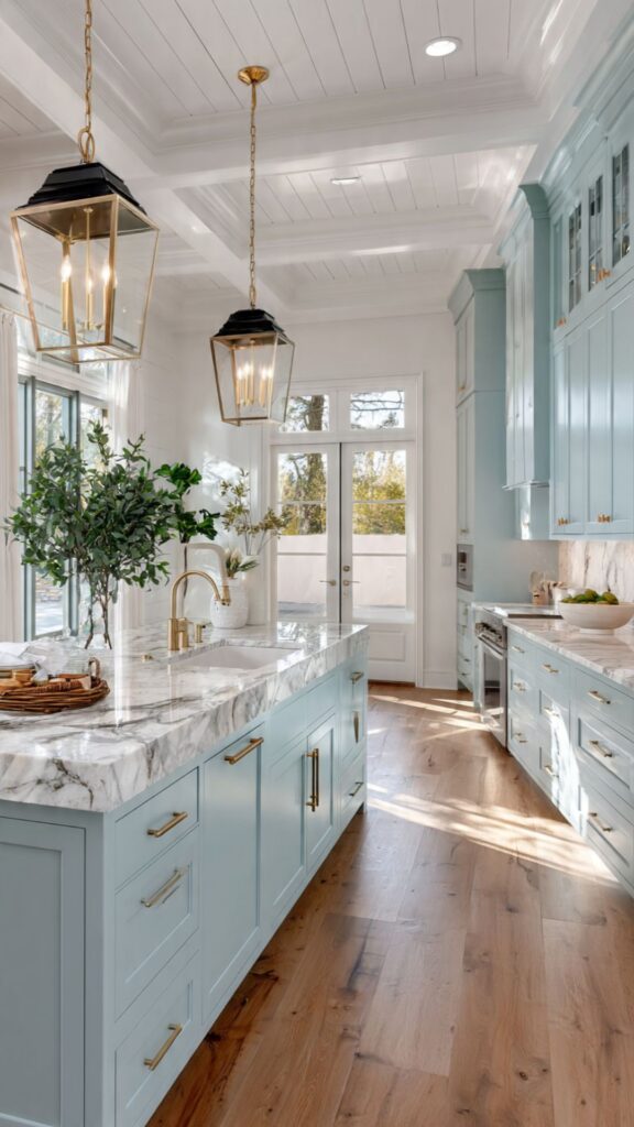
Powder blue kitchen cabinets sit at the quieter, more romantic end of the blue family. Think of the color you might find in a Swedish country kitchen or a weathered coastal cottage it is soft, slightly faded in character, and inherently inviting. If navy brings drama, powder blue brings exhale. It works particularly well in kitchens that receive strong natural light, where the pale pigment can shift beautifully throughout the day, looking crisp in morning light and almost lavender-tinged at dusk.
One unique advantage of powder blue cabinets is their compatibility with antique and vintage-inspired hardware. Aged brass, unlacquered bronze, or even old-fashioned black iron pulls look extraordinary against a soft blue ground the gentle contrast has an artisanal, crafted quality that brushed nickel or chrome cannot replicate.
This makes powder blue an excellent choice for homeowners who love the “collected-over-time” aesthetic rather than a brand-new, showroom feel. From a practical design standpoint, powder blue is also more forgiving of mistakes than deeper shades. Slightly mismatched grout, an imperfect tile choice, or a paint color that is not quite right on adjacent walls all become less glaring against a soft blue.
However, be cautious with very warm undertones in flooring or walls powder blue has cool undertones, and clashing warmth can make the cabinets look slightly green or grey rather than blue. Always test paint samples under your actual kitchen lighting before committing.
This Will Inspire You: Two Tone Kitchen Cabinet Ideas That Look Absolutely Stunning with Blue Kitchen Cabinets
Two-Tone Blue Kitchen Cabinet Designs:
Double the Impact
Two-tone kitchen cabinet design has become one of the most widely adopted trends in contemporary kitchen renovation, and blue plays a starring role in the best examples. The most popular pairing is navy or deep blue lower cabinets combined with white, cream, or light grey upper cabinets.
This arrangement draws the eye downward, visually grounding the space and making a room feel anchored rather than top-heavy. It also solves a common design dilemma: many homeowners want the boldness of blue but worry about overwhelming a smaller kitchen.
A less commonly discussed two-tone approach and one that genuinely surprises visitors is using two different shades of blue throughout the kitchen. Consider pairing a deep indigo on lower cabinets with a dusty, muted blue-grey on the uppers.
The tonal relationship keeps the palette cohesive while adding unexpected depth and sophistication. This technique is particularly striking in open-plan kitchens where the space is large enough to absorb the layered color without feeling busy.
Designer Insight: When using two-tone cabinets, always ensure the island (if present) is treated as a deliberate third element either repeating the deeper tone, introducing a contrasting wood, or using a statement color altogether. An island that matches neither the upper nor the lower cabinets can look like an afterthought rather than an intentional design decision.
The transition zone between the two tones usually the countertop line is where the magic happens in a two-tone blue kitchen. A bright white quartz with subtle veining creates a clean, natural break. An unlacquered brass faucet and hardware at this junction further unifies the look, adding a warm metallic thread that ties both tones together.
Future-thinking homeowners are also exploring vertical paneling or a contrasting backsplash at the transition point to make the split a deliberate design feature rather than simply a color change.
Blue Cabinets with Gold Hardware:
The Classic Luxury Pairing
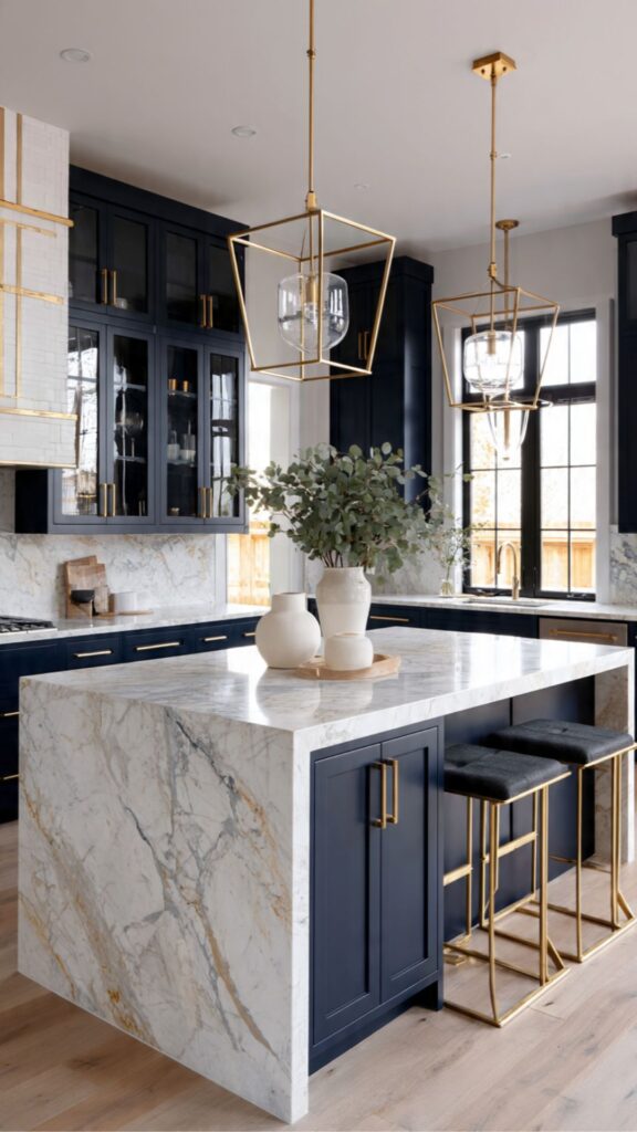
If there is one hardware choice that elevates blue kitchen cabinets from attractive to genuinely luxurious, it is gold specifically, unlacquered brass or matte gold finishes. The reason this pairing works so powerfully is contrast: blue is a cool, recessive color, while gold is warm and highly reflective.
Together they create a visual tension that feels rich and intentional rather than accidental. It is the same color relationship you see in centuries of decorative art, from blue-and-gold Persian tiles to Royal Delft pottery, which is exactly why it feels so timeless.
The specific type of gold hardware matters enormously, however. Polished gold (sometimes called champagne or bright gold) can look brash and overly formal with blue cabinets, particularly in modern kitchens. Brushed or satin gold has a softer warmth that blends more naturally.
Unlacquered brass is arguably the most interesting choice it develops a gentle patina over time, meaning your hardware evolves with the kitchen and takes on a quality that no factory finish can replicate. This living quality is precisely what design-savvy homeowners are gravitating toward in 2026.
Beyond pull handles and knobs, do not overlook the supporting cast: faucets, light switch plates, outlet covers, pendant light fixtures, and even cabinet hinges all contribute to the hardware narrative. A kitchen where the blue-and-gold relationship is carried through every metallic element from the pot filler above the range to the towel bar near the sink feels cohesive and considered.
Even small upgrades like replacing standard outlet covers with brushed gold versions have a disproportionate design impact for their low cost.
Blue and White Kitchen Combinations:
Crisp, Coastal & Classically Beautiful
Blue and white is perhaps the oldest and most universally beloved color combination in domestic design, drawing on traditions from Mediterranean fishing villages to New England shingle-style homes. In the kitchen, this pairing delivers a clean, optimistic quality that photographs well and appeals across demographics.
Blue cabinetry against white walls with white countertops creates a strong visual anchor without feeling oppressive or overly trendy an important consideration for anyone who plans to live in (or eventually sell) their home for many years.
The key to making a blue-and-white kitchen feel fresh rather than cliché lies in the details. Instead of a plain white subway tile backsplash which has become almost ubiquitous consider Moroccan-inspired white and blue patterned tiles behind the range for a focal-point moment of pattern.
Or use a soft-white limewash paint on the walls rather than bright white, which creates warmth and texture without disrupting the color relationship. These layered decisions transform a simple blue-and-white kitchen into something with genuine character and depth. A scenario worth imagining: a kitchen with soft dusty-blue Shaker cabinets, a white farmhouse sink, white oak floating shelves displaying ceramics in varying blue tones, and natural linen window treatments.
This kind of tonal layering blues ranging from pale to medium against a white ground creates a sense of gathered depth that feels collected and personal rather than interior-designed. It is a look that ages well precisely because it is rooted in humble, natural materials rather than high-gloss perfection.
Teal vs. Blue Kitchen Cabinets:
Understanding the Critical Difference
One of the most common mistakes homeowners make when choosing blue kitchen cabinets is accidentally selecting a teal or green-blue without realizing it until the cabinets are installed. Teal contains significant green undertones that make it read quite differently from true blue especially under different lighting conditions.
A cabinet swatch that looks clearly blue in a showroom under warm halogen lighting can shift dramatically toward green-blue under the cooler daylight in your kitchen. Understanding this lighting sensitivity is not optional; it is essential to avoiding an expensive mistake.
Teal cabinets are not inherently a wrong choice they simply require different pairing decisions than true blue. Teal works exceptionally well with warm brass hardware (the yellow-gold counteracts the green), terracotta-toned accessories, and natural oak or rattan accents.
True blue, by contrast, is more versatile with metals it accepts chrome, brushed nickel, black, and brass with equal ease. If you are drawn to teal, commit to it intentionally rather than accidentally, and plan your entire palette around its warmer, more complex character.
A simple test to determine whether a cabinet sample is teal or blue: place a pure-white piece of paper beside it in natural daylight. If the cabinet reads distinctly cooler than the white, it is likely a true blue. If you notice the paper makes the cabinet look greenish in comparison, you are looking at teal.
Many design professionals also recommend ordering actual door samples not just small paint chips because the color reads very differently at full scale. A 6-inch paint chip and a full kitchen cabinet door are two entirely different perceptual experiences.
Blue Lower Cabinets Only:
The Smart Strategy for Bold Impact
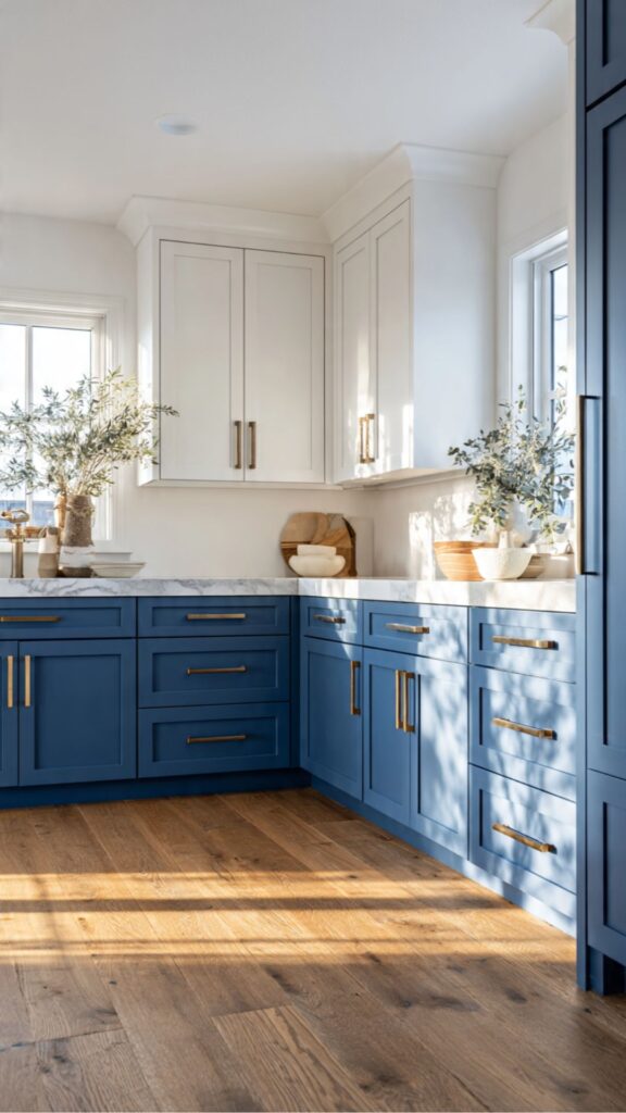
Choosing blue for lower cabinets only is one of the most strategic approaches available to homeowners who want a bold color without full commitment. The lower section of a kitchen naturally carries more visual weight base cabinets are where your eye goes first when entering a room, especially in open-plan layouts.
By concentrating the blue below the countertop line, you get the full impact of the color where it matters most, while the white or cream uppers keep the upper zone of the kitchen open, bright, and airy. This approach also has practical benefits that designers rarely mention. Lower cabinets sustain more wear and tear scuffs, bumps, cooking splatters, and dog-nose prints are all more common at floor level.
A dark or mid-tone blue actually hides these marks far better than white or light-colored base cabinets, meaning the choice is not only visually smart but genuinely pragmatic for family kitchens. You get the bold color where the durability argument most supports it.
For homeowners using this approach, a common next question is: what to do with the kitchen island? The most successful designs treat the island as a third design element rather than simply matching either the upper or lower cabinet color.
A deep navy island with white uppers and medium-blue base cabinets would feel overwhelming; however, a lighter blue-grey island with navy base cabinets and white uppers creates a graduated, tonal landscape that feels curated and intentional. Consider adding a contrasting countertop on the island butcher block against a marble kitchen countertop, for example to reinforce its identity as a distinct piece.
Best Countertops for Blue Kitchen Cabinets:
A Material-by-Material Guide
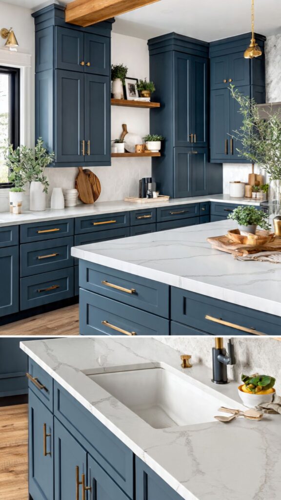
The countertop is the single most important pairing decision in a blue kitchen cabinets because it covers the most surface area after the cabinets themselves. White quartz remains the go-to recommendation for most blue cabinet shades because of its neutrality and durability, but this choice risks a slightly predictable outcome.
The more interesting pairings usually involve a countertop with visual texture the fine mineral grain of soapstone, the natural movement of marble, or the tactile warmth of oiled teak which creates a material conversation rather than a flat color exercise.
Countertop edge profile is another detail that dramatically affects the overall look. A thick, waterfall-style quartz countertop edge on navy cabinets reads as very contemporary and architectural. A classic ogee or bullnose edge on the same navy cabinets shifts the entire kitchen toward a more traditional aesthetic.
This single decision edge profile can make the same cabinet color feel five years apart in design terms, so always specify the edge consciously rather than accepting a standard default from your fabricator.
A Little Gem Right Here: Cream Kitchen Cabinet Ideas That Create a Beautiful Contrast with Your Blue Kitchen Cabinets
Blue Cabinets in Small Kitchens:
Making Bold Colors Work in Tight Spaces
The conventional wisdom in interior design warns against using dark or bold colors in small spaces, suggesting they will make rooms feel even smaller. For kitchen cabinets specifically, this advice needs significant nuancing.
The truth is that blue cabinets in small kitchens can actually feel more spacious than all-white cabinetry if they are paired correctly because a strong, clear color creates a sense of intentionality and definition that white often lacks in a compact space. A small kitchen that feels “designed” reads as more spacious than one that simply feels unfinished or overly cautious.
The specific strategies that make blue work in a small kitchen center on controlling contrast and ensuring light bounces effectively around the space. Lighter blue shades like powder blue, cornflower, or medium slate work far more naturally in compact kitchens than deep navy. Pairing any blue cabinet with a white or very pale countertop maximizes the light-reflective surface area.
Glossy or satin cabinet finishes help, too, as they pick up and redistribute ambient light in a way that matte finishes cannot. Mirrors or highly reflective backsplash tiles polished white subway tiles, for example, or mirrored mosaic amplify this effect further.
One insight that rarely appears in mainstream design content: in a galley or narrow kitchen, a bold blue on one run of cabinets paired with white on the opposite side creates a deliberate visual rhythm that draws the eye along the length of the kitchen rather than making it feel claustrophobic.
This “one wall blue, one wall white” approach is a professional trick for elongating a narrow space while still delivering the color impact the homeowner wants. Combined with continuous flooring running the full length and pendant lighting over any peninsula, this approach can make a genuinely small kitchen feel considered and spacious.
Painted vs. Factory-Finished Blue Cabinets:
What Nobody Tells You
One of the most consequential decisions you will make when choosing blue kitchen cabinets is whether to paint existing cabinets or purchase factory-finished ones. Both approaches are valid, but they differ significantly in outcome, longevity, and cost and the design content world tends to underserve this comparison.
Factory-finished cabinets are sprayed in a controlled environment with catalyzed lacquers or conversion varnishes that cure rock-hard. The result is a smooth, consistent surface that is dramatically more durable than anything a brush or roller can achieve on-site. If budget allows, factory finish is almost always the superior choice for the final quality of the surface.
Painting existing cabinets, however, is a legitimate and cost-effective option when done by a skilled professional using the right products. The critical variables are: thorough degreasing and sanding of surfaces, the use of a high-adhesion primer formulated specifically for cabinetry, and a high-quality waterborne alkyd or oil-modified enamel topcoat applied with an HVLP (high-volume low-pressure) spray gun rather than a brush.
DIY painted cabinets using standard wall paint a surprisingly common mistake will chip, peel, and look amateur within a year. The finish is everything with painted blue cabinetry. A color-specific note: darker blues like navy are far more demanding of surface preparation than lighter shades, because any imperfection in the substrate grain raise, dents, old finish showing through will telegraph visually through a dark paint film.
Light blues are more forgiving. If you are having existing cabinets repainted in a deep navy, ensure your painter fills and sands every ding and door-edge chip before priming, or the final result will disappoint regardless of the paint quality used.
Blue Cabinets with Open Shelving:
Balancing Bold Color with Breathing Room
Open shelving paired with blue cabinetry has become a defining aesthetic in contemporary kitchen design, and when executed well it is genuinely beautiful. The key dynamic at work is visual relief: solid blue kitchen cabinets doors create strong, opaque planes of color, while open shelves interrupt that density with a glimpse of the objects and materials behind them.
The result is a kitchen that feels simultaneously bold and breathable structured but not closed-off. This balance is particularly effective in kitchens where the homeowner has a collection of handmade ceramics, wooden cutting boards, or vintage glassware worth displaying.
The material of the open shelves matters greatly in a blue kitchen cabinets. Natural wood shelving white oak, walnut, or even simple pine provides warm contrast to the cool blue kitchen cabinets color and adds a handcrafted, organic note. White painted shelves, by contrast,
keep the eye reading the kitchen as primarily blue-and-white, which suits more formal or coastal-inspired aesthetics. Floating shelves in a dark metal or blackened steel create a more industrial, moody vibe when combined with navy or slate blue kitchen cabinets think Parisian bistro meets New York loft.
One practical consideration often overlooked: items on open shelving in a kitchen accumulate grease and dust at a rate that surprises most homeowners. This is not a reason to avoid open shelves, but it does mean styling them intentionally rather than overcrowding them.
A curated selection of items perhaps 40% fewer objects than you initially imagine looks better, photographs better, and requires far less frequent cleaning. Against a blue backdrop, the negative space between objects is itself a design element, allowing the color to breathe and the objects to read clearly rather than blurring into visual noise.
Lighting Tips for Blue Kitchen Cabinets:
The Overlooked Game-Changer
Lighting is the single most underestimated factor in how your blue kitchen cabinets will look in daily life, and it is astonishing how often it is chosen after all other decisions have been finalized. This is exactly backwards. The color temperature of your light sources measured in Kelvin dramatically shifts how a blue reads. Warm white bulbs (2700K–3000K) push blue kitchen cabinets toward a richer, slightly greenish-blue, almost like a twilight effect.
Cooler white bulbs (4000K–5000K) sharpen the blue and make it crisper and more vibrant. Daylight bulbs (5500K+) can make even navy look stark or clinical. For most blue kitchen cabinets, a warm-white (2700K–3000K) base light with cooler-white (3500K–4000K) under-cabinet task lighting strikes the best balance.
Under-cabinet LED strip lighting is non-negotiable in any blue kitchen cabinets that uses darker shades. Navy, indigo, and slate blue absorb light rather than reflecting it, which means the countertop zone can feel significantly darker than the rest of the kitchen.
Under-cabinet lighting resolves this instantly, brightening the work surface, illuminating the backsplash, and creating a beautiful “glow” that makes the blue kitchen cabinets feel warm and intentional rather than heavy and oppressive. This single addition costing as little as $150–$400 installed has more impact on the daily experience of a blue kitchen cabinets than almost any other element.
Pendant lighting above an island or peninsula is an opportunity to add a material that complements the blue palette. Rattan or woven pendants add organic warmth and suit powder blue and coastal-inspired kitchens. Aged brass or copper pendants reinforce the blue-and-gold pairing strategy discussed earlier.
Black steel pendants create a graphic, modern contrast with any shade of blue. What rarely works well over blue cabinetry is chrome or polished stainless steel pendants their cool, reflective surface competes with the blue rather than complementing it, producing a kitchen that feels sterile rather than designed.
Blue Cabinets in Modern Farmhouse Style:
Where Rustic Meets Refined
The modern farmhouse aesthetic characterized by shiplap walls, apron-front sinks, barn doors, and an overall sense of scrubbed-clean simplicity has proven to be a natural home for blue kitchen cabinets. However, the specific shade of blue matters enormously within this style.
Deep navy reads too urban and architectural for a true farmhouse feel; instead, opt for softer, slightly dusty or chalky blues that have an almost weathered quality think of paint colors like Benjamin Moore’s “Van Deusen Blue” or Farrow & Ball’s “Peignoir” mixed with blue. These shades carry the history and imperfection that the farmhouse style is built on.
Blue cabinets in a modern farmhouse kitchen work best when complemented by a specific supporting cast of materials: a fireclay apron-front sink (white or aged cream), unlacquered brass faucets and hardware, white tongue-and-groove ceiling details, and open shelving in reclaimed or knotty wood. These elements together create a palette of honest, humble materials that the blue sits within naturally.
The farmhouse aesthetic is fundamentally opposed to perfection, which means this is one style where minor variations in paint coverage or small wear marks on blue cabinet doors actually enhance rather than detract from the look.
An often-missed opportunity in the modern farmhouse blue kitchen cabinets: the floor. Wide-plank white oak hardwood floors, or large-format matte porcelain tiles in a warm off-white, create a neutral, natural canvas that allows the blue cabinetry to speak without competition.
Highly patterned floors encaustic tiles, for example can work beautifully in small doses (an entry or mudroom) but can visually overwhelm a kitchen where the cabinets are already making a bold blue statement. In farmhouse design, the restraint exercised in supporting elements is what allows the hero element the blue cabinet to shine.
Do Yourself a Favor: Modern Kitchen Design Ideas That Perfectly Complement Your Beautiful Blue Kitchen Cabinets
Future-Proofing Your Blue Kitchen:
Design Decisions That Last 20+ Years
Any designer will tell you that the most expensive kitchen renovation mistake is choosing something that feels urgently of-the-moment because trends move, and a kitchen is an investment that should deliver value for decades.
Blue kitchen cabinets, fortunately, are one of the more durable color choices available because they draw on a deep well of design heritage. However, future-proofing your blue kitchen cabinets also requires conscious decisions about the style of cabinetry, the hardware profile, and the broader design language of the space.
Shaker-style cabinet doors are universally considered the safest investment in door style because they are neither too traditional nor too contemporary they have existed for nearly two centuries and show no signs of fading from favor.
A blue Shaker cabinet will look relevant in 2026 in a way that a trendy flat-panel with integrated groove handles may not. Similarly, hardware profiles that are simple and architectural modest-sized bar pulls or plain round knobs age more gracefully than elaborate, detail-heavy designs that feel very specific to a particular moment in time.
“The question to ask yourself isn’t ‘Is this trendy?‘ It’s ‘Would this have looked appropriate twenty years ago AND twenty years from now?’ If the answer is yes, you have found something timeless.”
Looking ahead to the near future, blue kitchen cabinets are well-positioned to absorb the next wave of kitchen innovation: integrated smart appliances with custom panel fronts, induction-dominant cooking surfaces with cleaner countertop lines, and biophilic design elements like living walls or herb gardens built into kitchen architecture.
Deep blue cabinetry in particular provides a sophisticated, high-contrast backdrop for the growing category of smart-home displays and screens integrated into kitchen design a consideration that will be increasingly relevant as the “connected kitchen” matures over the next decade. Plan your kitchen for the home you will have in 10 years, not just the one you have today.
Final Thoughts: Your Blue Kitchen cabinets Await
Blue kitchen cabinets offer one of the most rewarding combinations in home design: timeless appeal, emotional warmth, and enormous versatility across every style and budget. From the commanding depth of navy to the breezy optimism of powder blue, the right shade paired with the right countertop, hardware, and lighting can completely transform the way your kitchen feels and functions. The 14 ideas in this guide give you a strategic, expert-level foundation to make choices you will love for years, not just seasons.
Ready to take the next step? Order at least three cabinet samples in your shortlisted blue shades and live with them in your actual kitchen for at least a week morning light, evening light, artificial light before making your final decision. That one habit separates great kitchen decisions from expensive regrets.

Sereen Khan is a passionate home decor writer and creative mind behind Trandy Villa, where style meets comfort in everyday living. She loves turning simple spaces into beautiful, functional homes using smart ideas, budget-friendly hacks, and modern design trends.


