
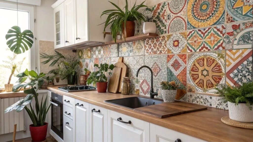
A Colorful Kitchen Backsplash adds style, texture, and personality to your kitchen walls. It protects the wall from spills and splashes. Colorful Kitchen Backsplash Ideas help create a fresh look with bold tiles, soft shades, unique patterns, and practical materials that suit every kitchen style.
Refresh your cooking space with Colorful Kitchen Backsplash inspiration that blends beauty and function. Bright colors, creative tile designs, and stylish finishes add warmth, depth, and character while making your kitchen feel more inviting and visually appealing every day.
Colorful Kitchen Backsplash Ideas offer many options for modern and classic kitchens. You can choose ceramic, glass, mosaic, or handmade tiles in vibrant colors. The right design complements your cabinets, countertops, and lighting. A thoughtful backsplash creates a balanced, attractive, and long-lasting kitchen space.
Sunny Yellow Zellige Tile
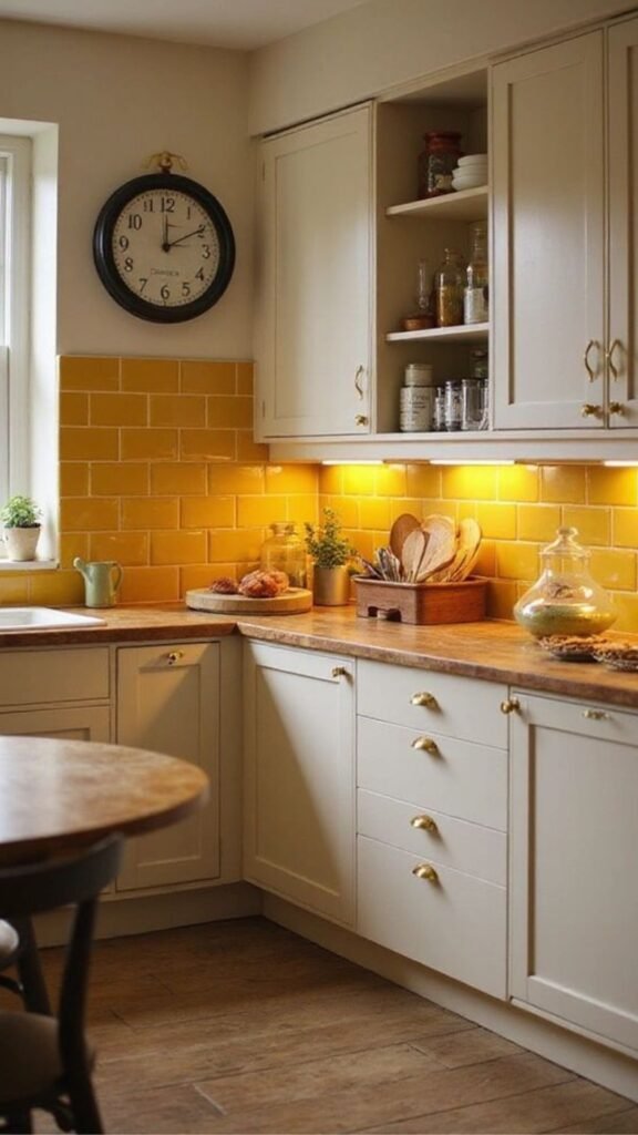
Zellige tile, the handmade Moroccan clay tile with its irregular surface and light-catching glaze, has become a favorite among designers for good reason. In a warm yellow tone, it brings a sense of sunlight into kitchens that lack strong natural light, particularly north-facing spaces. The slight variation in each tile means no two installations look identical, giving the wall a handcrafted quality that mass-produced ceramic simply can’t replicate. This makes it a strong choice for homeowners who want color without looking mass-market.
However, zellige requires a bit more care during installation than standard tile. Because the tiles are uneven, grout lines vary slightly, and installers experienced with the material will produce a far better result than a first-time DIYer. Sealing is also recommended since the clay body is more porous than porcelain. For kitchens with warm wood cabinetry or brass hardware, yellow zellige creates a cohesive, sun-washed palette that feels collected rather than trendy.
Budget-wise, expect to pay more per square foot than standard subway tile, but many homeowners limit the yellow zellige to a focal area behind the range or a prep sink while using a simpler tile elsewhere to control cost. This zoned approach is something top-ranking guides rarely mention, yet it’s how most designers actually specify the material in real projects.
Deep Emerald Green Subway Tile
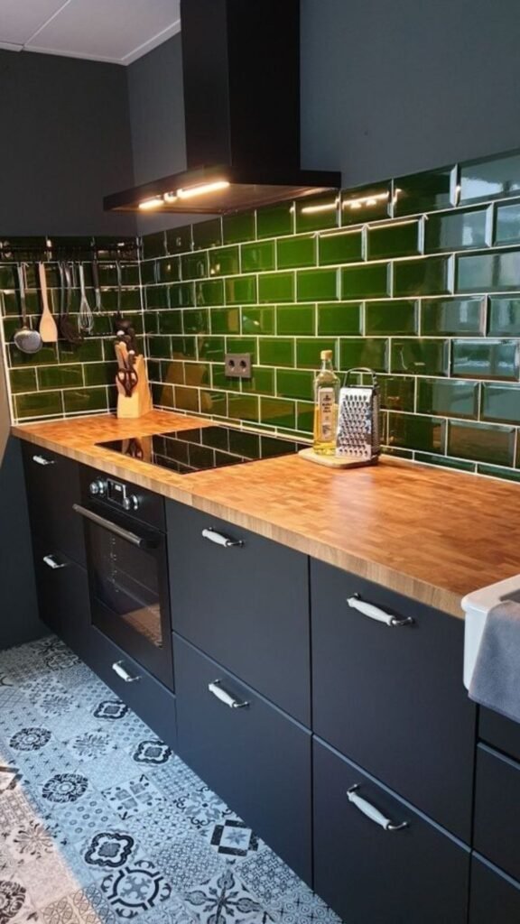
Green has moved from an occasional accent to one of the most requested backsplash colors, and emerald or forest-toned subway tile explains why. It reads as sophisticated rather than trendy, pairs naturally with brass, black, and white finishes, and works in both traditional and contemporary kitchens. Unlike brighter greens, emerald has enough depth to avoid feeling like a passing fad, which matters if you’re not planning to renovate again in five years.
The classic 3×6 subway shape keeps installation familiar and affordable, so most tile setters can complete the job without special training. For a more current look, consider a vertical stack or herringbone layout instead of the traditional running bond pattern the color does the visual work, so the layout can stay understated. Glossy finishes amplify the depth of the green and bounce light around darker kitchens, while matte finishes lean more muted and moody.
One practical note competitors often skip: dark grout (charcoal or black) against emerald tile hides staining far better than white grout, which can yellow near cooking areas within a year or two. If you love the crisp look of white grout, plan on resealing it annually to keep it looking sharp.
You Deserve to See This: Kitchen Backsplash Ideas That Perfectly Inspire Your Bold and Colorful Backsplash Style
Terracotta and Burnt Orange Tones
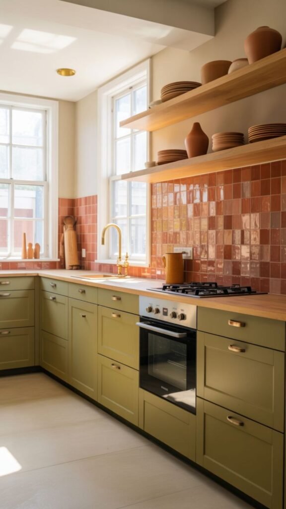
Terracotta backsplashes tap into the broader “warm minimalism” movement, where earthy, sun-baked colors replace the cool grays that dominated the 2010s. Burnt orange and terracotta tile pair beautifully with natural wood, rattan, and matte black fixtures, creating a kitchen that feels grounded and Mediterranean-inspired without leaning into full theme decor. This palette photographs warm even in artificial light, which is a genuine advantage for kitchens used mostly in the evening.
Handmade terracotta tiles, sometimes left unglazed, bring texture as well as color, though unglazed options need sealing to resist grease and moisture. Glazed terracotta is the more practical choice for an active cooking zone, offering the same warmth with easier daily cleanup. Either way, this is a color family that ages gracefully it won’t look dated the way some saturated trend colors eventually do.
A mini scenario worth considering: a small apartment kitchen with limited natural light often looks sterile in white or gray. Swapping in a terracotta backsplash instantly makes the space feel warmer and more finished, even without changing cabinets or countertops. It’s one of the highest-impact, lowest-cost updates a renter-friendly kitchen can make with peel-and-stick terracotta-toned tile.
Cobalt Blue Statement Wall
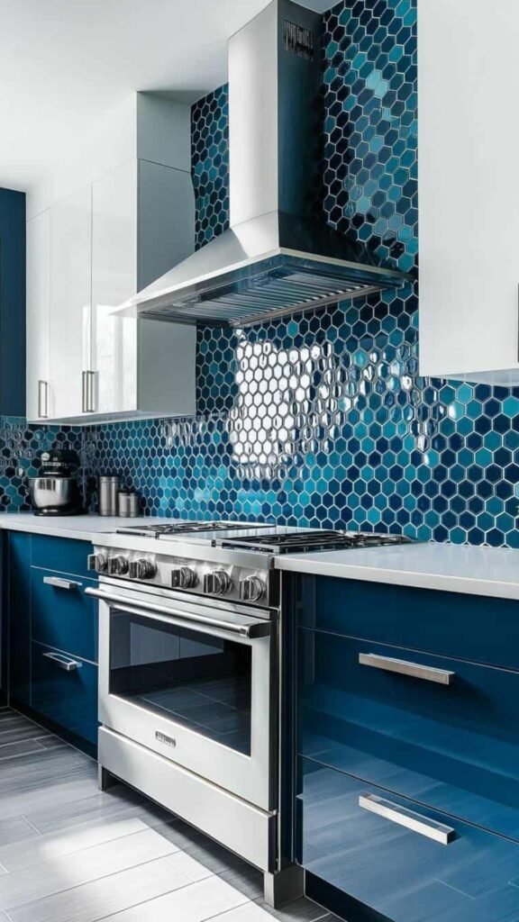
For homeowners who want real drama, a full cobalt blue backsplash extending from countertop to ceiling turns the kitchen into the room’s design centerpiece. This approach works best when the rest of the kitchen stays simple: white or wood cabinets, plain countertops, and minimal upper decor let the blue do the talking. Cobalt has enough saturation to feel confident but reads as classic rather than juvenile, unlike brighter primary blues.
Ceramic and porcelain tile in cobalt tend to hold their color better over time than painted alternatives, since UV exposure and grease can dull painted surfaces within a couple of years. If budget allows, a glazed ceramic tile with a slight sheen will keep the color vibrant far longer than a matte finish, which tends to show fingerprints and grease film more visibly.
It’s worth noting that full-height color walls are a bigger commitment than a standard backsplash, both financially and in terms of resale considerations. Buyers with strong personal taste may love it, while more conservative buyers may see it as a future project. If resale is a near-term concern, consider limiting the cobalt to the section behind the stove and using a neutral tile on adjacent walls.
Pink and Blush Tile
For a Soft Statement
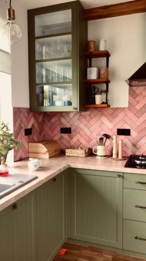
Blush and dusty pink backsplashes have found a lasting place in kitchen design, moving well beyond the “millennial pink” trend cycle. In a muted, dusty tone rather than a bright bubblegum shade, pink reads as sophisticated and works surprisingly well with black, brass, and even navy accents. It softens kitchens that otherwise lean heavily on hard surfaces like stone and stainless steel.
A useful distinction competitors rarely explain: warm-toned pinks (with peach or coral undertones) pair best with warm wood and brass, while cool-toned pinks (with mauve or lavender undertones) suit kitchens with chrome, black, or cool gray finishes. Matching the undertone to your existing metals prevents the backsplash from clashing with your fixtures, a mistake that’s common in DIY renovations.
Pink tile in a subway or fish-scale shape adds gentle texture without overwhelming the space, making it a good option for smaller kitchens where a bold color might otherwise feel too intense. Because the tone is soft, it also pairs well with patterned elements elsewhere, such as a printed rug or open shelving with colorful dishware.
Moroccan-Inspired Patterned Tile
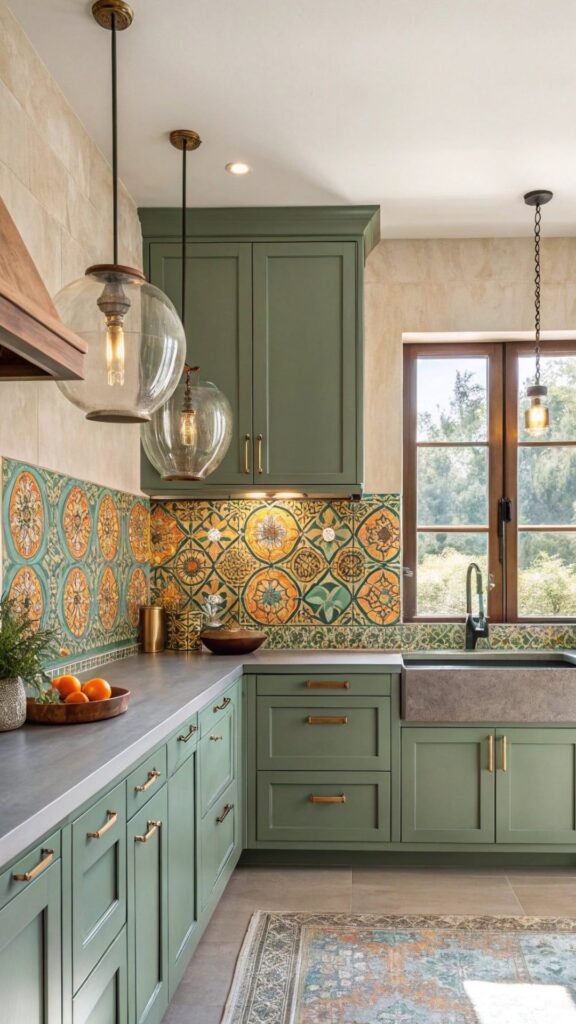
Patterned cement or ceramic tile, often inspired by Moroccan and Spanish design traditions, brings color and geometry together in a single installation. These tiles typically combine two or three colors in repeating motifs, giving a kitchen visual richness without requiring additional decor. They work particularly well as a full backsplash rather than a small accent, since the pattern needs room to repeat and establish rhythm.
Cement tile, the traditional material for this style, is porous and needs sealing before and after grouting, plus periodic resealing to resist staining near the stove. Porcelain versions that mimic the same patterns have become widely available and offer nearly identical looks with far less maintenance, which is a smart substitution for busy households that still want the aesthetic.
When choosing a patterned backsplash, keep the rest of the kitchen simple. Solid-color cabinets, plain countertops, and minimal hardware ornamentation let the pattern remain the focal point instead of competing with other busy elements. This is the single most common mistake in patterned-tile kitchens: too many competing patterns fighting for attention in one room.
Absolute Game Changer: Pink Kitchen Ideas That Show How a Colorful Backsplash Can Transform Your Whole Kitchen
Turquoise and Teal Glass Tile
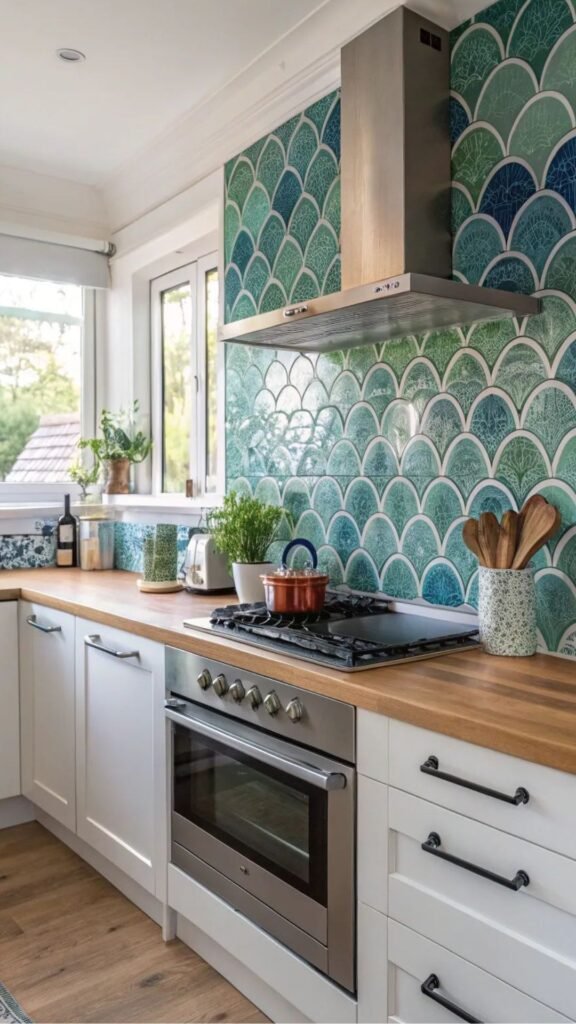
Glass tile in turquoise or teal delivers a level of color saturation and light reflection that ceramic simply can’t match. The glossy surface bounces light around the kitchen, which makes it a strong choice for spaces near a window or under strong task lighting. It also cleans easily, since glass doesn’t absorb grease or moisture the way porous materials can.
Teal sits in an interesting middle ground cooler than green, warmer than blue which makes it flexible across different cabinet colors. It pairs well with white, navy, and warm wood tones alike, giving homeowners more design flexibility if they update cabinetry down the line. This adaptability is a practical advantage worth weighing against more polarizing colors like hot pink or bright orange.
One consideration competitors often leave out: glass tile shows grout lines and installation imperfections more clearly than matte ceramic, so hiring an experienced installer matters more here than with forgiving materials like zellige. A slightly higher labor cost is a fair trade for a flawless, light-catching result that will define the kitchen for years.
Mixed-Color Mosaic Backsplash
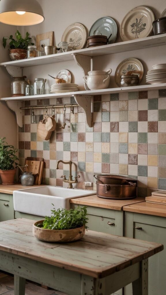
For homeowners who don’t want to commit to a single color, a mixed mosaic backsplash blends several complementary tones into one cohesive design. This approach works especially well in eclectic or maximalist kitchens, where the backsplash becomes a curated collage rather than a single flat color. Mosaic tile sheets, sold in pre-arranged patterns, make installation more approachable than sourcing individual tiles in different colors.
The key to a mosaic that looks intentional rather than chaotic is limiting the palette to three or four related hues — for example, teal, navy, and seafoam, or terracotta, rust, and cream. Random assortments of unrelated bright colors tend to feel busy rather than curated. Sticking to a defined color family, even within a mosaic, keeps the final result looking designed rather than accidental.
Mosaic backsplashes also offer a practical advantage for imperfect walls or budget-conscious projects: smaller tile pieces are more forgiving of minor surface irregularities than large-format tile, and remnant or discounted mosaic sheets are often available at a lower cost than full-size designer tile.
Bold Red or Rust Accent Wall
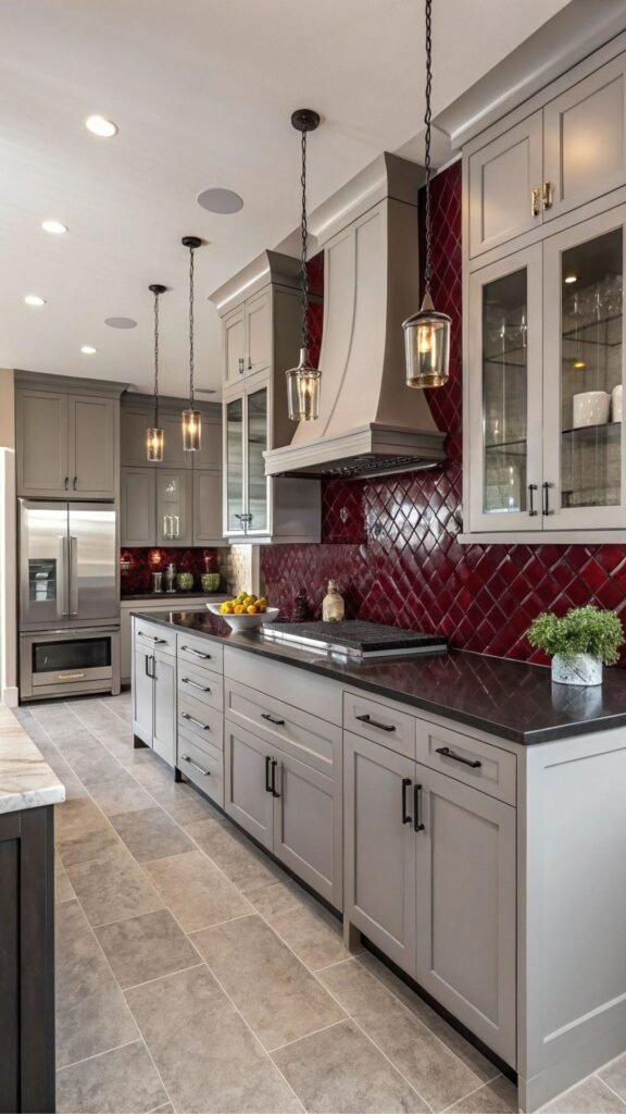
Red is one of the more polarizing backsplash colors, but used thoughtfully, it creates an unforgettable focal point. Rust and brick-red tones are more approachable than a true fire-engine red, offering warmth and saturation without feeling overwhelming in a full kitchen. This color family works particularly well in kitchens with black or dark wood cabinetry, where the red adds energy without clashing.
A practical strategy for nervous homeowners: limit red or rust tile to the range wall only, treating it as a framed focal point rather than a full-room commitment. This keeps the color contained to the area where cooking naturally draws attention anyway, while the rest of the kitchen stays in calmer, neutral tones that won’t compete for visual space.
Because red pigments in tile glaze are generally stable, color-fastness isn’t a major concern the way it can be with painted surfaces. The bigger consideration is grease visibility matte red tile can show grease spots more readily than a glossy finish, so a satin or gloss glaze is the more forgiving choice near an active stovetop.
Ombre and Gradient Tile Walls
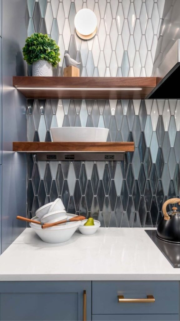
Ombre backsplashes, where tile color gradually shifts from light to dark (or one hue to another) across the wall, have become a favorite technique among designers looking to add movement without pattern. This effect works especially well in open-concept kitchens, where the gradient can visually anchor the cooking zone while still feeling airy and light at the transition points.
Achieving a convincing ombre effect requires careful planning before installation tiles need to be sorted and mapped out by shade before the setter begins, since manufacturers rarely produce true gradient sets. Many designers source individual solid-color tiles in four to six related shades and plan the gradient layout on paper first, a step that’s often skipped in rushed DIY attempts and leads to an uneven, patchy result.
This approach suits homeowners who want a colorful backsplash that still feels calm and cohesive rather than a single bold block of color. It’s a technique competitors rarely break down in practical terms, yet it’s one of the more achievable ways to bring multiple colors into a kitchen without the visual chaos of a full mosaic.
Colorful Grout
As a Budget-Friendly Twist
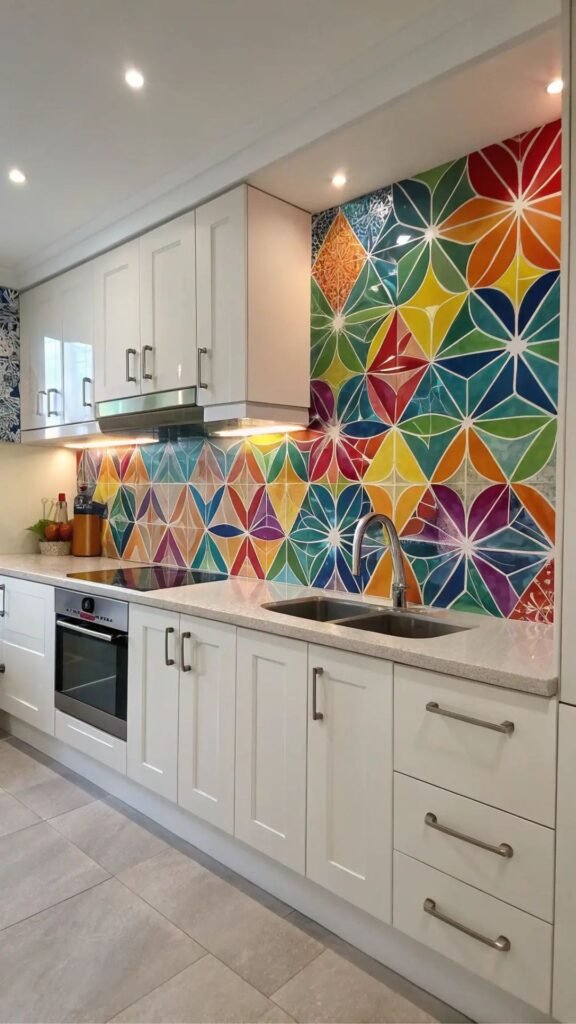
Not every colorful backsplash idea requires colorful tile. Choosing a bold grout color navy, ochre, or forest green — against classic white subway tile is one of the most affordable ways to add personality to a kitchen. Because grout covers a much smaller surface area than tile, the material cost stays low even with premium colored grout products.
This approach also offers a built-in advantage for renters or homeowners planning to sell soon: colorful grout can be reapplied or the tile can be reused with standard white grout in the future, making it a lower-commitment way to experiment with color. It’s a strategy professional stagers sometimes use precisely because it’s reversible without demolition.
Colored grout does require sealing to prevent fading and staining over time, and epoxy grout formulations hold color better than standard cement-based grout in high-moisture, high-grease kitchen environments. For anyone hesitant about a full colorful tile commitment, this is the lowest-risk entry point into the trend.
This is Pure Gold: Blue Kitchen Cabinet Ideas That Pair Beautifully with a Stunning Colorful Backsplash
Hand-Painted Talavera Tile
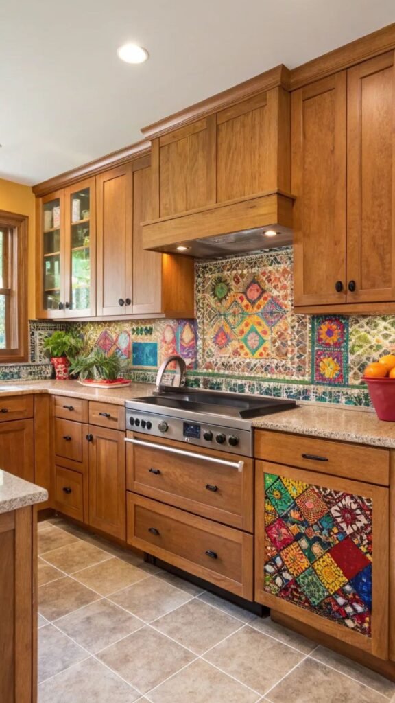
Talavera tile, the traditional hand-painted ceramic style from Mexico, brings intricate color and pattern together in a way mass-produced tile can’t replicate. Each tile is painted individually, so the colors often combinations of blue, yellow, green, and red carry natural variation that gives the wall genuine artisanal character. This makes Talavera a strong choice for kitchens aiming for a collected, storied feel rather than a showroom look.
Because these tiles are handmade, sourcing consistent quantities for a full backsplash can take longer than ordering mass-produced tile, so this is a project that benefits from planning several weeks ahead rather than a last-minute purchase. Working directly with artisan suppliers or specialty importers often yields better quality and more authentic patterns than mass-market reproductions.
Talavera tile pairs naturally with warm wood cabinetry, wrought iron fixtures, and open shelving displaying colorful dishware, creating a kitchen with genuine cultural depth. Sealing is essential, as with most glazed ceramic, but the investment pays off in a backsplash that functions as functional art rather than a purely utilitarian surface.
Two-Tone Color Blocking
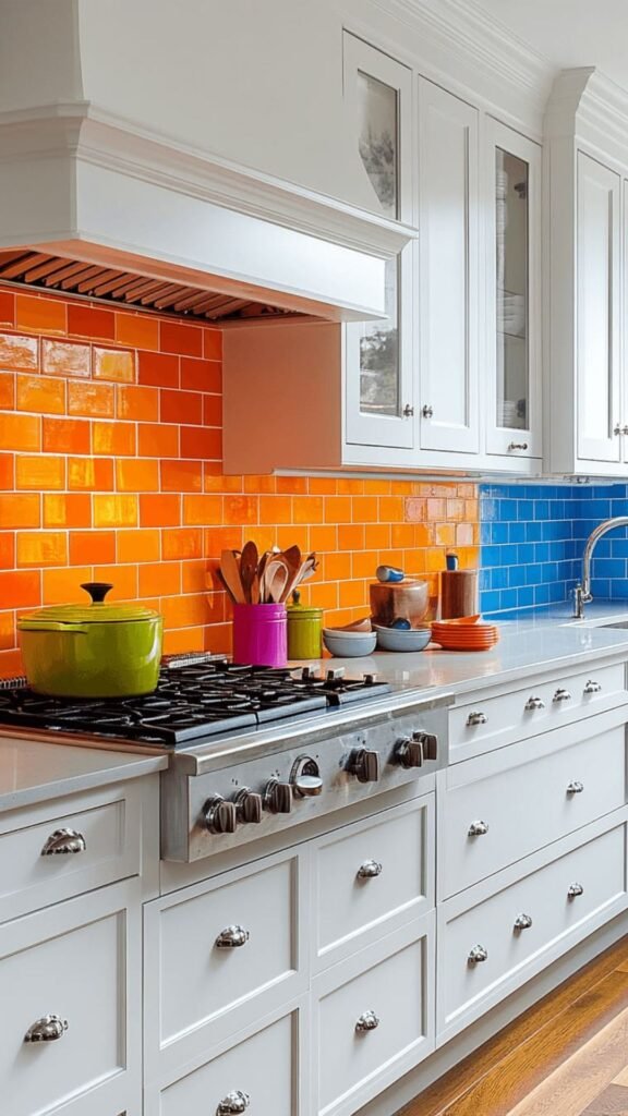
Color blocking dividing the backsplash into two distinct color zones, often split horizontally or around a window is a technique borrowed from graphic design that’s gaining traction in kitchens. A common application places a bolder color, like mustard or teal, on the lower half near the countertop, with a neutral or white tile above, creating a grounded, intentional look without covering the whole wall in saturated color.
This approach gives homeowners a way to test bolder colors with less commitment than a full wall, since the neutral upper section balances the visual weight. It’s also a smart solution for kitchens with limited wall space between counters and upper cabinets, where a single bold color might otherwise feel cramped rather than impactful.
A detail worth noting: the transition line between the two colors should align with a natural break point, such as the bottom of a window or a shelf ledge, rather than an arbitrary height. This small planning step is what separates a professional-looking color-blocked backsplash from one that looks like an afterthought or a mistake mid-installation.
Metallic-Infused Colorful Tile
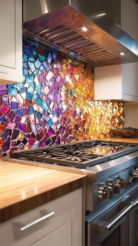
Tile that combines color with metallic glazes think iridescent teal, bronzed copper, or shimmering plum adds dimension that flat-colored tile can’t achieve. These finishes catch light differently throughout the day, making the backsplash feel dynamic rather than static. They work particularly well in kitchens with limited natural light, where the reflective quality helps bounce available light around the room.
Metallic glazes are typically more expensive than standard glossy or matte finishes, and they can show water spots more visibly, so a quick wipe-down after cooking helps maintain their shine. This is a detail worth discussing with your installer, since some metallic tile lines recommend specific cleaning products to avoid dulling the finish over time.
Used as a full backsplash, metallic-colorful tile can feel like a lot for an everyday kitchen, so many designers reserve it for a smaller accent a niche behind open shelving, or a strip above the range where its shimmer reads as a deliberate design moment rather than overwhelming the room.
Final Thoughts
A colorful kitchen backsplash is one of the most effective ways to add character to a kitchen without a full remodel. From warm terracotta and bold cobalt to budget-friendly colored grout, there’s an approach here for every style and price point.
The best choice ultimately depends on your cabinetry, lighting, and how bold you’re ready to go. Whichever direction you choose, start small if you’re unsure a colorful backsplash is easier to love when it feels like your own.

Team TrandyVilla is the passionate home decor team behind Trandy Villa, where style meets comfort in everyday living. The team loves transforming simple spaces into beautiful, functional homes through smart ideas, budget-friendly hacks, and modern design trends. Their content focuses on helping readers create homes that feel both stylish and personal without spending too much.