Two Tone Kitchen Cabinets: 16 Best Ideas, Tips & Design Guide for 2026

Two tone kitchen cabinets have moved far beyond a passing trend they are now one of the most searched and implemented design strategies in modern kitchen remodeling. By using two different colors, finishes, or materials on upper and lower cabinets (or island vs. perimeter), homeowners can create visual depth, personality, and a custom-built look without the cost of a full renovation.
Two tone kitchen cabinets use two different colors on upper and lower cabinets to create visual contrast and depth. This design approach adds personality, defines kitchen zones, and makes any space feel custom-built. It works across all styles farmhouse, contemporary, and transitional. Homeowners choose this method to refresh their kitchen without a full renovation. It is one of the smartest and most flexible design strategies available today.
Two tone kitchen cabinets transform an ordinary kitchen into a space that feels intentionally designed and visually rich. The right color pairing brings balance, character, and a high-end look that single-color kitchens simply cannot achieve. Whether bold or subtle, this approach suits every budget, every style, and every kitchen size with remarkable ease.
Dark lower cabinets hide daily scuffs and splashes far better than all-white cabinetry. Lighter upper cabinets reflect light and keep the space feeling open and airy. Popular combinations include navy and white, sage and cream, and wood paired with painted finishes. Hardware, countertops, and backsplash all play a key role in tying both tones together. Choosing the right color combination starts with matching the undertones of both cabinet colors.
Classic White Upper and Dark Lower Cabinets:
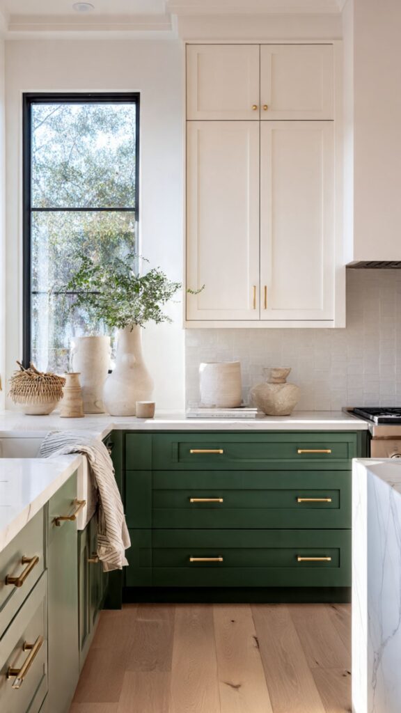
The most iconic two tone kitchen cabinets combination remains white upper cabinets paired with dark lower cabinets most commonly navy blue, charcoal, forest green, or black. This pairing has endured for decades because it works across virtually every architectural style, from farmhouse to contemporary to transitional. The white uppers keep the kitchen feeling open and airy, while the dark lowers ground the space with visual weight and sophistication.
One often-overlooked insight: the success of this combination heavily depends on the undertone of the white you choose. A crisp bright white like Benjamin Moore Chantilly Lace pairs best with cool-toned darks like slate or blue-gray. A warm white or off-white like Sherwin-Williams Alabaster pairs more harmoniously with deep greens, tawny navies, or warm charcoal.
Mixing undertones creates a subtle discord that most homeowners cannot identify but can certainly feel. For cabinetry style, shaker-style doors are the most compatible with this combination, offering just enough detail to prevent the pairing from looking flat, without competing with the color contrast itself.
If you opt for flat-panel (slab) doors, adding textural interest through the countertop, backsplash, or hardware becomes even more important to maintain visual richness. Hardware selection here is critical.
Brushed gold or unlacquered brass pulls add warmth and prevent the combo from feeling too sterile. Matte black hardware creates a more editorial, high-contrast look. Avoid chrome in dark-lower kitchens unless your countertops and appliances already incorporate it otherwise it looks like an afterthought.
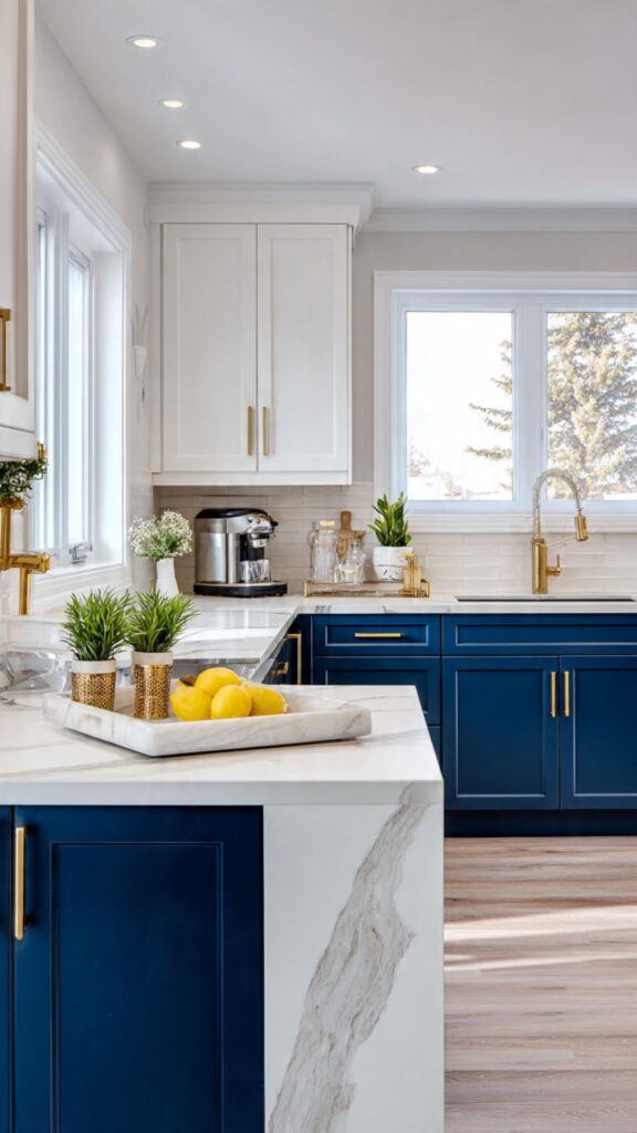
Navy Blue and White Two Tone Kitchens:
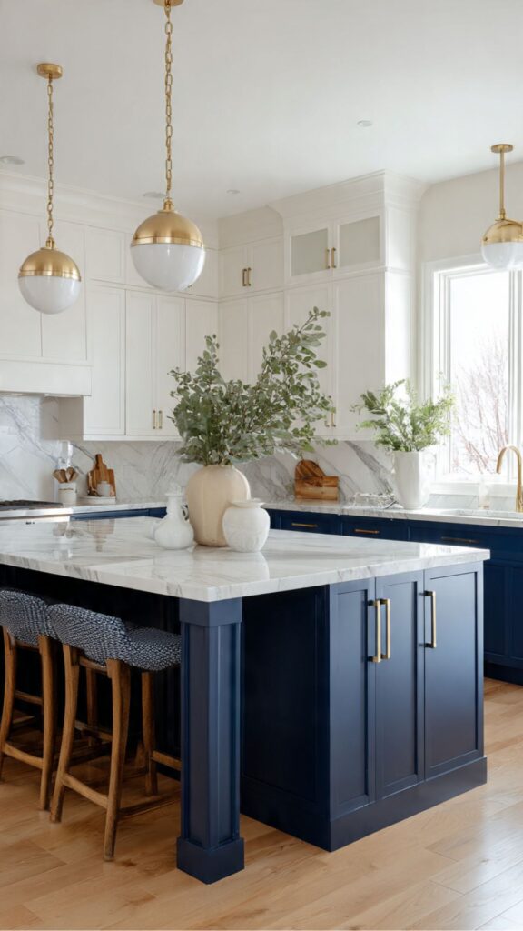
Navy blue has become one of the most beloved cabinet colors of the last five years, and for good reason. It reads as both classic and contemporary, works in traditional and modern settings, and pairs beautifully with a wide range of countertop materials including marble, quartz, butcher block, and concrete.
When used as the lower cabinet color against white uppers, navy transforms a kitchen from ordinary to editorial. The shade of navy matters enormously. Benjamin Moore Hale Navy, Sherwin-Williams Naval, and Farrow & Ball Stiffkey Blue all read as navy but carry slightly different undertones some lean purple, some lean green-blue, and some sit pure cool.
Always test a large swatch in your actual kitchen lighting before committing, because navy can read dramatically differently under warm incandescent light versus cool LED or natural daylight. A unique design insight that competitors often skip: navy lower cabinets work exceptionally well in kitchens with lower ceilings because they visually compress the lower half of the room, drawing the eye upward toward the lighter upper cabinets and ceiling.
This creates an illusion of vertical space a trick that interior designers use frequently in galley kitchens or older homes with standard 8-foot ceilings. Consider adding a navy island in a predominantly white kitchen as a gentler entry point.
This gives you the two tone effect without committing to full navy lowers, allows you to test how you live with the color, and creates a natural focal point in open-plan kitchens. Pair with waterfall quartz or a butcher block top to complete the look.
Must Read : Black Kitchen Cabinet Ideas That Pair Beautifully with Two Tone Styles.
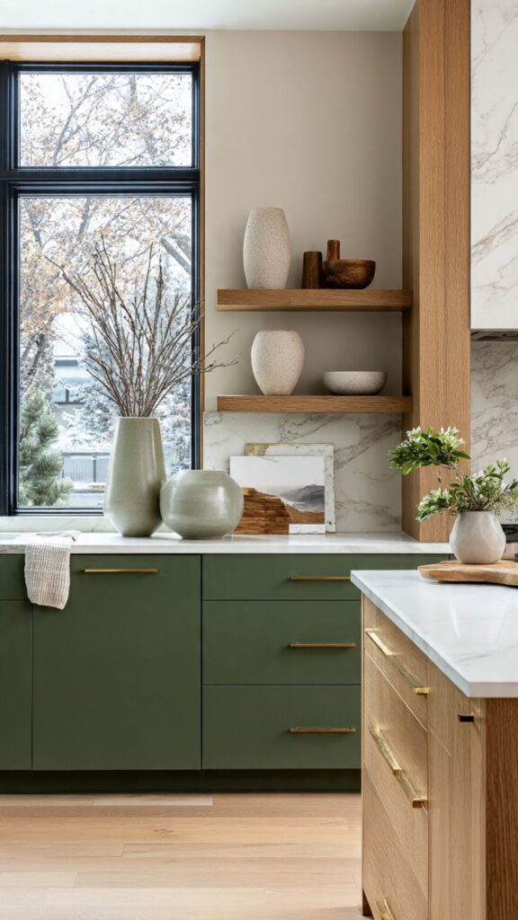
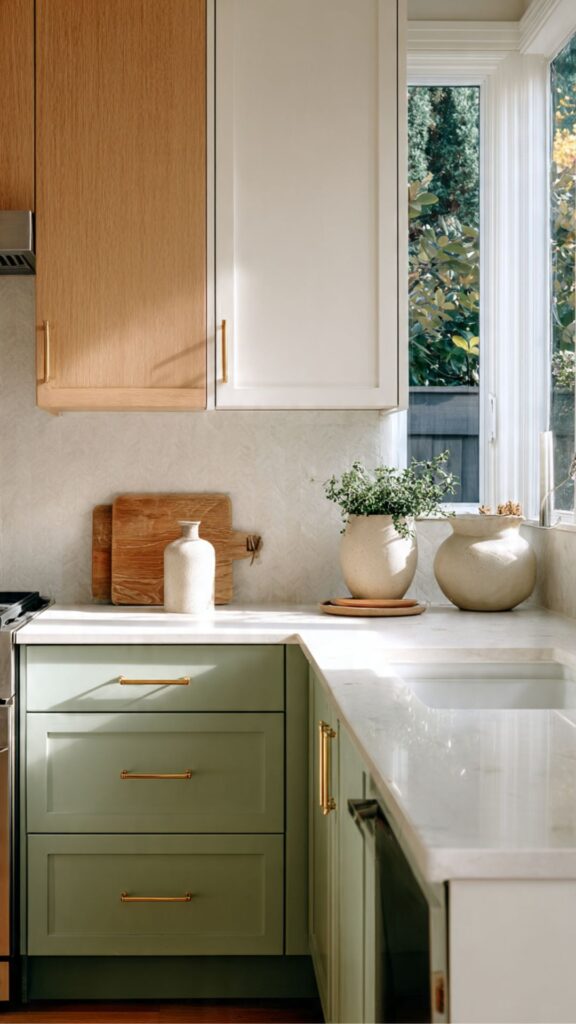
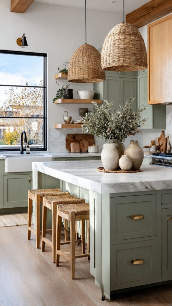
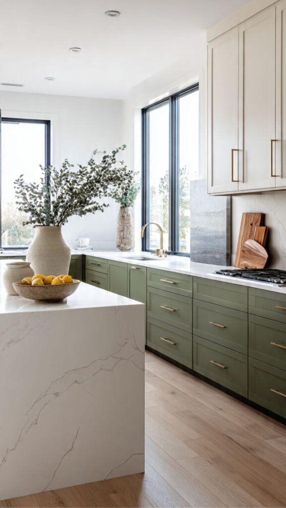
Sage Green and Cream Two Tone Cabinetry:
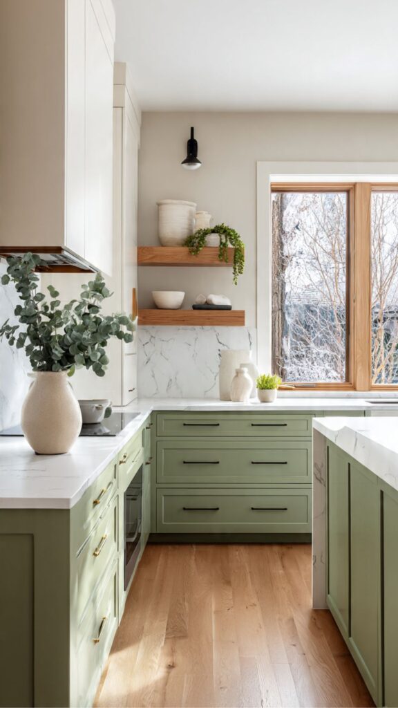
Sage green has emerged as one of the defining cabinet colors of the mid-2020s, and its pairing with cream or off-white upper cabinets creates a kitchen aesthetic that feels simultaneously timeless and very much of this moment. Unlike louder greens such as emerald or kelly, sage sits in a muted, gray-green territory that reads as naturally calming a quality that makes it particularly well-suited to kitchens, where we spend significant time cooking, eating, and gathering.
The sage-cream pairing works because both colors occupy similar luminosity levels they are both relatively soft which means the contrast is gentle rather than jarring. This creates what designers call a “tonal” two tone effect, where the kitchen feels harmonious and restful rather than boldly contrasted. For homeowners who love the idea of two tone cabinets but fear it might look too busy, the sage-cream combination is the ideal entry point.
From a practical standpoint, sage green shows fingerprints and grease less obviously than pure white, making it a smart choice for the lower cabinets that are handled most frequently. However, the exact shade of sage can make or break the combination.
Avoid sages that lean too yellow-green (they can look dated quickly) or too blue-green (they can compete with the cream). The most flattering sages for this pairing sit in a gray-green sweet spot, such as Farrow & Ball Mizzle or Benjamin Moore Saybrook Sage.
This combination pairs especially well with warm wood open shelving, unlacquered brass or antique bronze hardware, and a textured linen or zellige tile backsplash. Countertops in warm white marble or a honed limestone work beautifully here, completing a kitchen that feels organic, thoughtful, and layered the opposite of the cold, sterile white kitchens that dominated the 2010s.
Two Tone Kitchens with Wood Accents:
One of the most sophisticated evolutions in two tone kitchen cabinets design is the incorporation of natural wood as one of the“tones.” Rather than using two painted colors, homeowners and designers are increasingly pairing a painted cabinet color often white, charcoal, or black with a natural wood finish on either the island, the lower cabinets, or open shelving. This creates a warmth and texture that no paint color can fully replicate.
The wood species and finish matter as much as the pairing color. Light woods like white oak, maple, or birch pair beautifully with crisp whites, creating a Scandinavian-inspired warmth. Darker woods like walnut, smoked oak, or dark-stained ash pair powerfully with charcoal or black painted cabinets for a dramatic, high-end look. Mid-tone woods like natural oak or ash pair best with muted, earthy painted tones terracotta, mushroom, dusty blue.
A key insight that many design articles miss: the wood’s grain direction matters for the two tone composition. Vertical grain wood panels on cabinet doors create a sleek, contemporary look that works well with flat-panel door styles. More prominent horizontal grain or wide-plank looks add a rustic or organic quality that suits shaker or inset cabinetry better. Matching the grain orientation to the overall cabinet style prevents the combination from looking like a compromise.
This approach also ages beautifully. Wood is one of the few cabinet materials that improves with time it develops patina, character, and depth in a way that painted finishes cannot. By incorporating wood as one of the two tones, you are investing in a kitchen that will look even better in ten years than it does today. Pair with matte black hardware and integrated appliances for a look that is both current and lasting.
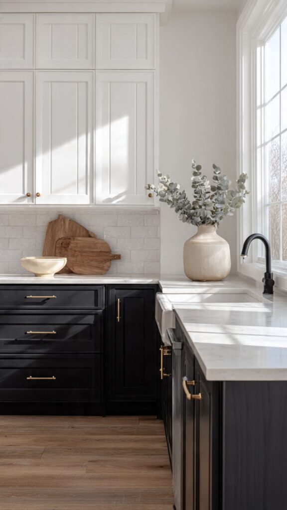
Black and White Two Tone Kitchen Cabinets:
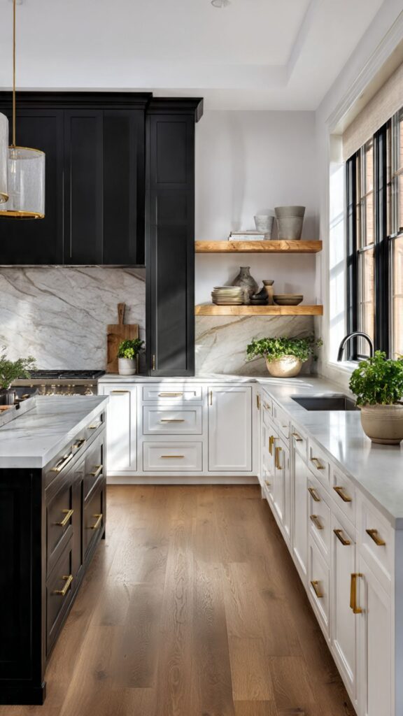
The black-and-white two tone kitchen cabinets is the ultimate high-contrast approach bold, graphic, and unapologetically sophisticated. When executed well, it creates a kitchen that feels like a piece of architectural art. When done poorly, it can look either cold and clinical or dated and over-designed. The difference lies almost entirely in the supporting materials, textures, and proportions.
For most kitchens, black lower cabinets with white uppers is the safer and more flexible arrangement. Black lowers anchor the space dramatically without making it feel cave-like, since the eye is naturally drawn downward. White uppers reflect light and keep the kitchen from feeling heavy.
For smaller kitchens, this proportioning is especially important reversing it (black uppers, white lowers) can make the ceiling feel lower and the room feel more enclosed. What separates a magazine-worthy black-and-white kitchen from a predictable one is the third element the texture breaker.
This could be a dramatic veined marble countertop, a handmade zellige tile backsplash in warm white, a statement light fixture in aged brass, or a stretch of warm wood open shelving. This third element softens the contrast and prevents the kitchen from looking like a chess board rather than a home.
One future-focused insight: the next wave of black-and-white kitchens is moving away from gloss finishes toward matte and ultra-matte surfaces. Matte black cabinetry reads as more sophisticated and architectural, while matte white reads as softer and more organic. The combination of two matte surfaces creates a quiet luxury aesthetic that is earning significant attention in high-end kitchen design circles heading into 2026.
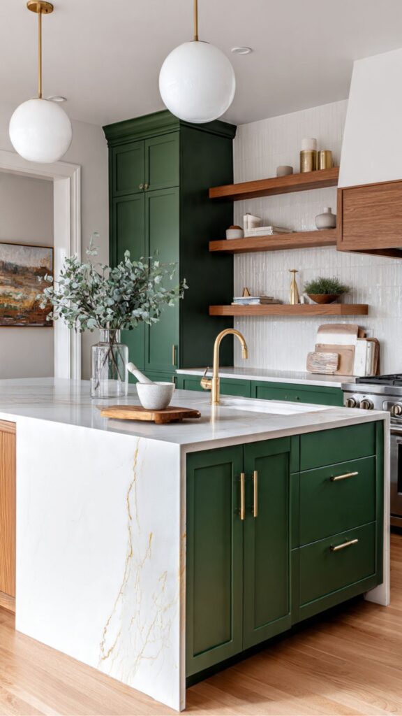
Two Tone Cabinets with a Contrasting Island:
Using a contrasting island is perhaps the most approachable introduction to two tone kitchen cabinets design. Rather than committing to two different colors across all cabinets, you paint or finish the island in a contrasting color while keeping the perimeter cabinets in a single color.
This is lower risk, lower cost, and allows even cautious homeowners to experiment with contrast in a contained way. The island is the natural focal point of most open-plan kitchens, so giving it a contrasting color amplifies its visual importance while adding personality to what might otherwise be a one-note space.
Popular island color choices for two tone kitchens include: navy paired with white perimeters, forest green paired with cream perimeters, black paired with white perimeters, and natural wood paired with any painted color.
An often-missed design consideration: the island’s color should relate to something else in the kitchen the hardware finish, the backsplash, the flooring, or the upholstery on bar stools. When the island color feels completely isolated from every other element in the room, it reads as an afterthought rather than a deliberate design move.
For example, a navy island looks far more intentional when the bar stool fabric carries a navy or indigo thread, or when the backsplash tiles include a navy accent.
For maximizing the effect, use the same countertop material across both the island and the perimeter cabinets. This creates visual continuity that unifies the two-color scheme and prevents the kitchen from feeling too fragmented. A single consistent countertop such as a white quartz or a calacatta marble ties the two tones together beautifully.
Go Check : Farmhouse Kitchen Ideas That Work Perfectly with Two Tone Cabinet Designs.
Light Gray and White Two Tone Kitchen Cabinets:
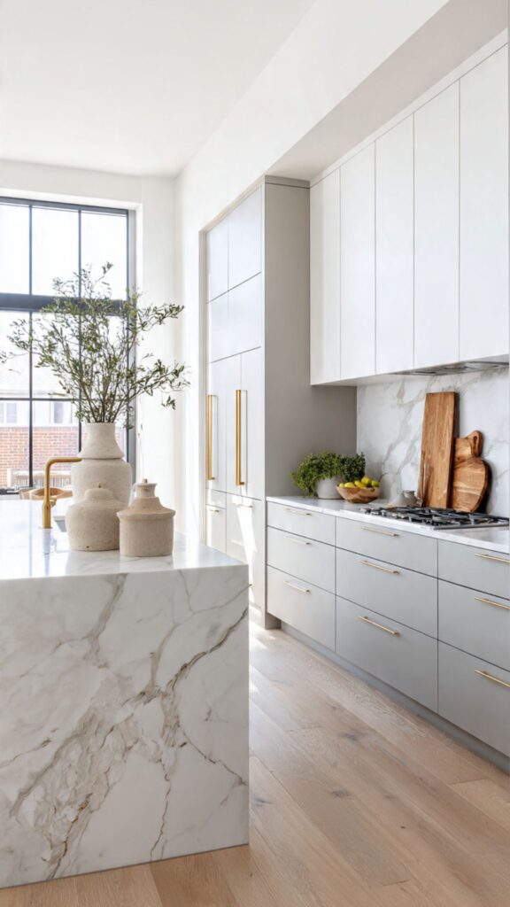
Light gray and white is the understated, quiet luxury version of the two tone kitchen. Unlike high-contrast pairings like navy-and-white or black-and-white, this combination achieves its elegance through subtlety a tonal layering that creates depth without drama. It is particularly popular in transitional-style kitchens that want to feel updated and sophisticated without veering into bold contemporary territory.
The challenge with light gray and white is avoiding the flat, lifeless result that can occur when both tones are too similar. The solution is to introduce textural variation matte finishes on one set of cabinets and a subtle sheen on another, or adding depth through the grain of painted cabinet profiles.
Shaker-style doors with slightly deeper reveals add enough shadow to prevent the combination from looking washed out. One nuanced insight that most articles overlook: warm-toned grays and warm whites must be paired together, and cool-toned grays must pair with bright or cool whites.
Mixing a gray with green undertones against a white with pink undertones creates a subtle but persistent color clash that most homeowners describe as “something feels off” without being able to pinpoint why. Stick within the same undertone temperature and the result will always feel cohesive.
This pairing works beautifully in kitchens with significant natural light, where the two tones shift throughout the day as the light changes appearing almost identical in bright midday sun and distinctly layered in the warm light of early morning or evening. This dynamic quality is part of what makes the gray-white combination feel so alive and special in real life, even when it looks deceptively simple in photographs.
Two Tone Kitchens in Small Spaces:
Small kitchen design is where two tone cabinetry really proves its strategic value not just as an aesthetic tool, but as a spatial manipulation technique. Used correctly, contrasting cabinet colors can make a small kitchen feel more purposeful, organized, and even larger than it actually is. Used incorrectly, they can make the space feel chopped up and chaotic.
The safest and most effective approach in small kitchens is to use lighter colors on the upper cabinets and slightly deeper tones on the lower cabinets. This follows the natural visual logic of a room, where heavier elements sit below and lighter elements sit above, mimicking how the natural world is organized.
Light uppers reflect ambient light back into the room, maintaining openness, while slightly deeper lowers add definition without enclosing the space. A smart small-kitchen strategy: use the two tone approach to define different functional zones.
For example, in an L-shaped kitchen, you might paint one arm of the L in a slightly different tone to suggest a prep zone versus a cooking zone. This creates the visual impression of a larger, more purposeful space, even when the actual square footage is limited. It is a technique used in high-end compact urban kitchen design.
Avoid using very dark lower cabinets in galley kitchens with no windows or limited natural light in these cases, a tonal two tone with two values of the same color (light gray and medium gray, for example) creates contrast and depth without darkening an already dim space. Pair with under-cabinet lighting to keep the lower zone feeling intentional rather than gloomy.
Warm Terracotta and Cream Two Tone Cabinets:
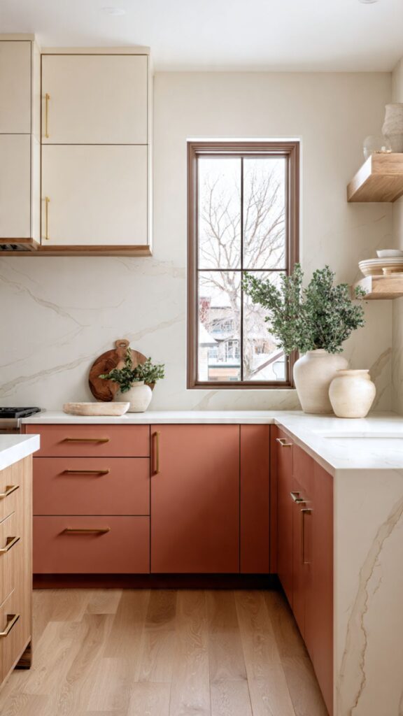
Terracotta has re-entered the interior design conversation with significant force, driven by a broader cultural shift toward warmer, earthier, more human-feeling interiors. In kitchen cabinetry, terracotta a warm, reddish-orange clay tone paired with cream or parchment upper cabinets creates a kitchen that feels deeply Mediterranean, grounded, and full of warmth. It is one of the most emotionally resonant color combinations available in kitchen design right now.
The key to making terracotta work on cabinets is choosing the right shade. True terracotta on cabinets can read as overly orange in certain lighting conditions. More successful are the dusty, muted versions terracottas that lean slightly brown or pink, such as Benjamin Moore’s Etruscan Brick or Farrow & Ball’s Dead Salmon. T
hese sit in a place between rust and blush that reads as sophisticated rather than overwhelming. This pairing works best in kitchens with natural stone or terracotta floor tiles, linen or jute textiles, raw plaster walls, exposed wooden beams, or any other material that supports a warm, tactile aesthetic.
When the surrounding materials are cold polished concrete floors, stainless steel appliances, cool marble countertops the terracotta cabinets can look incongruous. Always design the two tone cabinet choice as part of a complete material palette, not in isolation.
For countertops, honed travertine, warm Calcutta gold marble, butcher block, or a textured leathered granite all complement this pairing beautifully. Avoid stark white quartz countertops here the cool, bright white creates a disconnect with the warmth of the terracotta and cream below. Even a warm-veined white quartz with gold or cream veining will work better than a pure icy white.
Two Tone Open Shelving Integration:
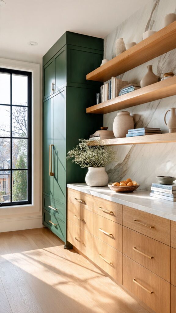
One of the most progressive and design-forward applications of the two tone kitchen cabinets concept involves integrating open shelving as a third element that bridges the two cabinet colors. Rather than a strict upper-versus-lower division, this approach creates a layered composition painted uppers, open shelving in the middle zone at or just above eye level, and contrasting lowers that makes the kitchen feel curated and editorial.
This design strategy solves one of the most common complaints about traditional two tone kitchens: the hard horizontal line where two colors meet can sometimes feel arbitrary or dividing. Open shelves serve as a visual buffer zone, creating a natural break point and transition between the two cabinet colors. The shelf material wood, painted metal, stone becomes a design element in its own right, mediating between the two tones.
Practically, the open shelf zone works best for displaying items that contribute to the kitchen’s aesthetic: beautiful ceramics, olive oil bottles, cookbooks with attractive spines, small plants, and artisan objects. Avoid cluttering open shelves with everyday mismatched items in a two tone kitchen cabinets with this level of design intentionality, the shelf display should be curated with the same care as the cabinet colors.
For the construction details: floating shelves in white oak or walnut with hidden brackets look the most architecturally refined. Bracket-style shelves in a metal that matches the cabinet hardware (brushed gold, matte black, antique bronze) read as more decorative and traditional. Either approach works within the two tone framework the key is choosing shelves that were selected rather than defaulted to.
Two Tone Kitchen Cabinets with Bold Hardware:
Hardware is the jewelry of kitchen cabinetry, and in a two tone kitchen, it carries additional weight because it must work harmoniously across two different cabinet colors rather than one. The wrong hardware choice can undermine an otherwise beautiful two tone scheme; the right choice can unite contrasting cabinets into a cohesive, refined composition.
Unlacquered brass is currently one of the most beloved hardware choices for two tone kitchens, and for good reason. It introduces warmth that bridges cool contrasts (navy and white, for example) and complements warm contrasts (sage and cream) without competing with either.
Crucially, unlacquered brass develops a natural patina over time it darkens and develops character which makes the kitchen feel more personal and lived-in as the years pass. Matte black hardware is the other dominant choice, particularly for high-contrast two tone schemes.
Matte black works on both light and dark cabinet colors, which makes it uniquely versatile in a two tone kitchen. It also photographs extremely well a practical consideration for those who want their kitchen to translate beautifully in real estate photos or social media content.
A hardware insight that is frequently missed: in two tone kitchens, hardware size and silhouette should remain consistent across both cabinet colors even if the finish is the same throughout. Using longer, more linear pulls on the lower cabinets and smaller knobs on the upper cabinets can create a subtle size-appropriate visual hierarchy that feels deliberate. Avoid switching between dramatically different hardware shapes on upper versus lower consistency of form creates unity even when the cabinet colors are different.
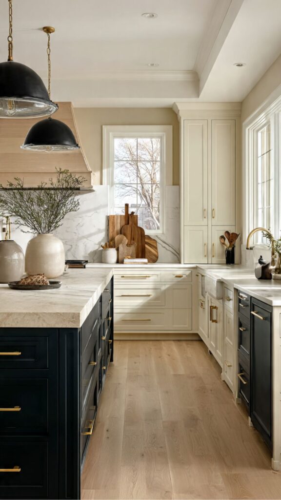
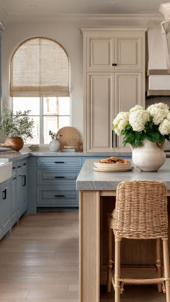
Two Tone Kitchen Cabinets for Farmhouse Style:
The farmhouse kitchen aesthetic has long embraced contrast white beadboard cabinets paired with an unpainted or butcher-block island, open wood shelving next to painted cabinetry making it a natural stylistic home for formal two tone cabinet design.
The key in farmhouse two tone kitchens is leaning into materials that feel handcrafted, imperfect, and slightly historical rather than sleek and contemporary. Color choices for farmhouse two tone kitchens typically skew softer and more saturated in a historic way dusty blues, muted sage, cream, off-white, olive, and warm charcoal.
Bold contemporary colors like graphite or high-gloss black can look out of place in a farmhouse setting unless balanced with enough natural wood and linen to soften the effect. The goal in farmhouse design is always warmth, not impact.
Cabinet door style matters enormously here. Shaker-profile doors are the most widely used in farmhouse kitchens, but beadboard panel inserts on lower cabinet doors add a distinctly farmhouse character that works beautifully as a material contrast to plain painted upper cabinets. The beadboard texture creates a subtle tonal variation even within a single color, adding depth and authenticity.
Accessorizing is where farmhouse two tone kitchens truly come to life. Vintage-style open shelving in reclaimed wood, a porcelain or fireclay farmhouse sink, aged-bronze or oil-rubbed-bronze faucets, woven baskets, and patterned textiles on bar stools or window treatments all reinforce the two tone palette while grounding it firmly in the farmhouse aesthetic. Every object in the kitchen should feel like it belongs to the same story.
Two Tone Kitchen Cabinets in Contemporary Design:
Contemporary kitchen design is currently undergoing a significant shift away from the all-white, minimalist aesthetic that dominated the 2010s. In its place, a more layered, material-rich approach is emerging and two tone cabinetry is at the center of this evolution.
Contemporary two tone kitchen cabinets pair bold or unexpected color choices with sleek flat-panel cabinetry, integrated appliances, and ultra-refined materials. In a contemporary context, the two tone kitchen cabinets approach often replaces the traditional upper-lower split with more architectural divisions one wall of cabinetry in a dramatic tone, an island in a contrasting material, or tall pantry cabinets in a different finish from the run of base cabinets along the wall.
This architectural thinking creates a kitchen that feels more like a designed interior and less like a stock product. Color in contemporary two tone kitchen cabinets tends toward the unexpected: deep forest green paired with warm concrete-look panels, matte black paired with white oak, dusty mauve paired with warm white, or smoky blue-gray paired with brushed stainless.
These combinations would have been considered daring five years ago but are increasingly mainstream in architectural and design circles as homeowners become more confident and visually literate. The future of contemporary two tone cabinetry is pointing toward material diversity as much as color diversity. Combining a painted lacquer finish with a fluted glass insert, or a matte laminate with a stone-look porcelain panel, introduces textural contrast that goes beyond color contrast alone.
This multi-layered approach to two tone kitchen cabinets design is where the most interesting contemporary kitchens are being built right now, and it is a strong directional indicator for where kitchen design is heading through 2026 and beyond.
Two Tone Cabinets and Countertop Coordination:
Countertop selection is arguably the most important decision in a two tone kitchen cabinets it is the horizontal surface that visually connects both cabinet colors and either resolves or compounds the tension between them. A countertop that is thoughtfully chosen can make an audacious two tone kitchen cabinets combination look completely natural; a poorly matched countertop can make a carefully planned combination look disjointed.
The most universally successful countertop for two tone kitchens is a warm white or cream-veined marble or quartz. The warmth prevents it from competing with either the light or dark cabinet, and the veining introduces visual movement that bridges the two colors without forcing them to match. Pure icy white countertops can work but require the cabinet colors to be harmonious enough that the counter reads as a neutral mediator rather than a third competing element.
One countertop strategy that is underused in two tone kitchen cabinets: using a different countertop on the island than on the perimeter. When the island is already a contrasting cabinet color, a contrasting countertop on the island amplifies its focal-point status. For example, perimeter cabinets in white with a white quartz counter, contrasting island in navy with a butcher block top this creates a richly layered kitchen that feels curated and highly intentional.
Waterfall countertops where the countertop material extends vertically down the side of the island deserve special mention in two tone kitchen cabinets. When the island is a contrasting color, a waterfall edge in a stone or quartz material creates a powerful architectural statement that further emphasizes the island as a distinct design element within the larger two tone kitchen cabinets composition. It is a high-impact detail that significantly elevates the finished result.
Do See : Luxury Living Room Ideas That Match the Elegance of Your Two Tone Kitchen.
Two Tone Cabinet Color Psychology and Choosing the Right Combination:
Color psychology in kitchen design is more than an abstract theory it has measurable effects on mood, appetite, energy levels, and how much time people want to spend in a space. In a two tone kitchen cabinets, you are working with two colors simultaneously, which means understanding how those colors interact emotionally is as important as understanding how they interact visually.
Deep blues and greens in kitchens are associated with calm, focus, and appetite suppression which sounds counterintuitive for a cooking space but actually reflects a modern lifestyle reality. Many high-end clients now want kitchens that feel like retreats rather than stimulating, high-energy cooking theaters. Dark lower cabinets in these tones create a grounding quality that makes the kitchen feel more like a room to linger in rather than a space to rush through.
Warm tones terracotta, ochre, warm caramel, spiced orange stimulate appetite and conversation, making them excellent choices in kitchens designed for families and entertaining. Pairing these warm lower tones with a neutral cream or warm white upper creates a kitchen that feels energizing and welcoming without being overwhelming.
When choosing your two tone kitchen cabinets combination, work from the one color you love most. Start with the anchor color the one that speaks to you most strongly and then use the following rule: if your anchor color is cool-toned (blue, green, gray), select a warm neutral as the second tone (cream, warm white, warm gray) to create balance.
If your anchor color is warm-toned (green with yellow, terracotta, sage with brown), pair with a cool neutral (crisp white, blue-gray) to prevent the kitchen from feeling heavy. This warm-cool balance is the underlying logic behind almost every successful two tone kitchen cabinets combination.
Two Tone Kitchen Cabinets:
Long-Term Investment and Resale Considerations
Many homeowners hesitate at two tone kitchen cabinets because of a perceived risk: will this design choice hurt the home’s resale value? The evidence from the real estate market increasingly suggests the opposite is true when executed well, two tone kitchen cabinets are among the kitchen features that most consistently attract buyer attention and increase perceived value, particularly in the mid-to-upper price brackets.
The caveat is“when executed well.” A two tone kitchen cabinets that uses dated color combinations, inconsistent hardware, or poor color matching between cabinets and supporting materials can read as a dated or unfinished renovation.
However, a thoughtfully designed two tone kitchen cabinets in a timeless combination navy and white, sage and cream, wood and painted reads as a custom, high-quality investment that differentiates the home from cookie-cutter renovations.
From a durability standpoint, it is worth investing in high-quality paint products for two tone kitchen cabinets. Cabinet-specific paints from brands like Benjamin Moore (Advance), Sherwin-Williams (Emerald Urethane), or Farrow & Ball offer superior adhesion, hardness, and washability compared to standard wall paint.
The incremental cost is significant, but the durability difference over a 10-year period is equally significant, particularly for high-traffic lower cabinets.
Looking ahead, the two tone kitchen cabinets trend shows no signs of declining. Color forecasters and kitchen design industry reports for 2025–2027 consistently point to the continued rise of color in kitchens, with two tone kitchen cabinets and tonal layering among the strategies being most widely adopted. Choosing a two tone kitchen cabinets in 2026 is not chasing a trend it is investing in a design approach that is becoming the new baseline expectation for thoughtfully designed kitchen interiors.
Conclusion
Two tone kitchen cabinets offer one of the most powerful and versatile tools available in kitchen design today combining aesthetic sophistication with practical benefits like better stain resistance, zonal definition, and long-term value.
Whether you choose a bold navy-and-white contrast or a quiet sage-and-cream tonal pairing, the key is in the details: undertone alignment, consistent hardware, supportive countertops, and thoughtful proportioning. Start with the color that excites you most, apply the warm-cool balance principle to select your second tone, and let the rest of the design grow from there your dream kitchen is closer than you think.

Sereen Khan is a passionate home decor writer and creative mind behind Trandy Villa, where style meets comfort in everyday living. She loves turning simple spaces into beautiful, functional homes using smart ideas, budget-friendly hacks, and modern design trends.


