
11 top Picture Wall Ideas That Transform Any Room Into a Personal Gallery

Picture Wall Ideas help homeowners display memories, artwork, and personal style in one organized space. These arrangements add balance, warmth, and character to empty walls. They improve room focus, support interior themes, and create a atmosphere through frames, photos, pieces.
Picture Wall designs turn blank areas into personal galleries filled with meaning and style. They combine family photographs, artwork, and creative layouts for a polished appearance. This decorating idea adds comfort, interest, and personality while making every room feel inviting.
Modern Picture Wall Ideas include gallery layouts, floating shelves, black and white photographs, and mixed media displays. These styles suit bedrooms, living rooms, hallways, and staircases. Consistent spacing, matching frames, and balanced arrangements create a appearance that supports stylish interiors.
The Classic Gallery Wall:
Curating an Eclectic Mix That Looks Intentional
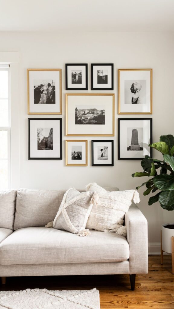
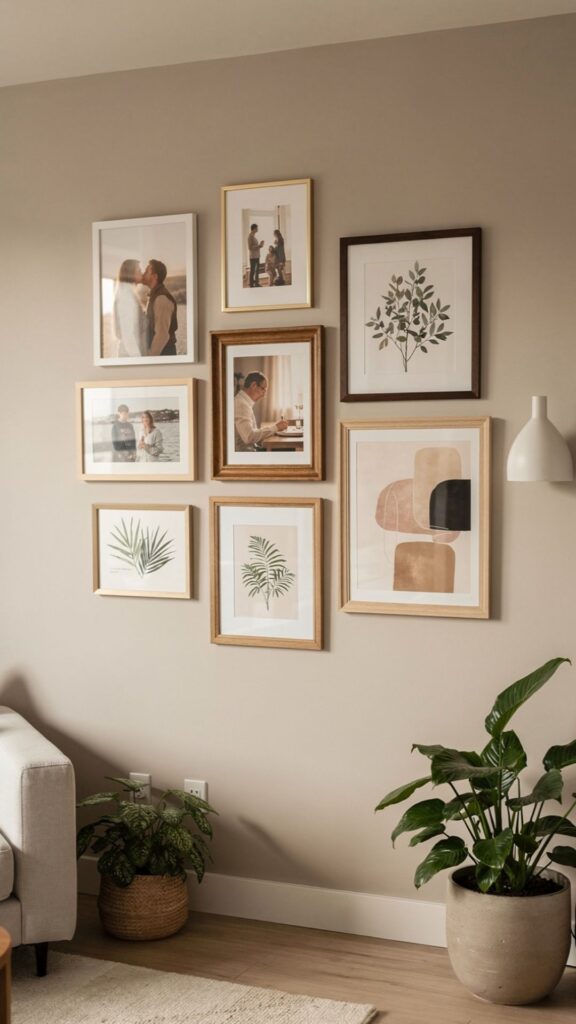
The gallery wall is the most popular and recognisable form of picture wall arrangement and also the most frequently executed poorly. The distinction between a gallery wall that looks professionally curated and one that looks chaotic lies almost entirely in how the pieces relate to each other. Successful gallery walls are not random collections of things stuck to a wall.
They are compositions that achieve visual unity through the consistent use of one or two shared elements whether that is a unified frame colour, a consistent mat width, a shared colour palette across the artwork, or a coherent thematic thread running through all the pieces.
The practical process of planning a gallery wall begins on the floor, not the wall. Lay all your frames face-up on the living room floor and arrange them as if the floor were the wall. This allows you to experiment with different compositions adjusting spacing, swapping pieces in and out, trying different anchor arrangements without making a single hole in the plaster.
Photograph your floor arrangement from directly above (standing on a chair works well) so you have a reference image to guide your installation. This simple step eliminates the most common gallery wall installation mistake: committing to a layout that looked good in your imagination but does not work in practice.
The anchor piece is the structural key to any gallery wall. This is typically the largest or most visually significant piece in the collection the one that establishes the visual centre of gravity for the whole arrangement. Install the anchor piece first, then build the composition outward from it, maintaining consistent spacing (typically 5–8cm between frames) as you go.
Inconsistent spacing is the single most common technical error in gallery wall installation: when gaps vary randomly between frames, the composition looks accidental rather than designed. A consistent gap, maintained with a spacer cut from cardboard, takes thirty seconds and makes a significant visual difference.
Expert Tip: Before you hammer a single nail, cut paper templates of every frame and tape them to the wall with painter’s tape. Live with the arrangement for 24–48 hours, view it from the room’s normal sightlines, and adjust before you commit to any holes.
One gallery wall insight that rarely appears in mainstream guides: the visual relationship between the gallery wall and the furniture below it is as important as the internal arrangement of the frames. A gallery wall that floats 60cm above a sofa looks disconnected.
The bottom of the lowest frame should sit approximately 20–25cm above the top of the sofa back, close enough to feel visually connected but with enough breathing room to avoid looking cramped. This relationship anchors the picture wall to the room’s furniture plan and integrates it into the overall interior composition rather than treating it as a separate decorative layer.
Symmetrical Grid Layout:
The Foolproof Picture Wall for Design Beginners
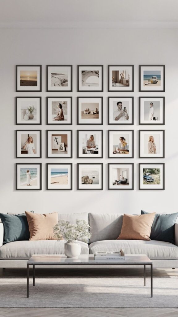
If the organic gallery wall feels intimidating too many variables, too much opportunity for error the symmetrical grid layout is the most reliable and forgiving alternative. A grid arrangement uses identical frames in a regular pattern (2×2, 3×3, 2×4, and so on) to create a clean, architectural picture wall that is almost impossible to get wrong.
The visual logic is simple and immediately legible: the grid imposes order and precision on the arrangement, which means the content of the frames photographs, prints, artwork can vary without the composition ever feeling chaotic.
The critical success factor in a grid arrangement is precision during installation. Even a 5mm variation in the spacing between frames becomes visually obvious when frames are identical and the pattern is regular the human eye is extremely sensitive to deviations from expected symmetry.
The professional approach is to create a measuring template: a piece of paper or thin card cut to the exact width of the gap you want between frames, used as a spacer during installation. Combined with a quality spirit level for every frame, this eliminates the cumulative drift that causes grid arrangements to arrive at the final frame slightly lower or higher than they should be.
Content selection for a grid arrangement benefits from a unifying concept. A 3×3 grid of nine identical black frames displaying family portraits in black and white is a classic approach that is both timeless and deeply personal. A 2×4 grid of botanical prints in matching gilt frames creates a formal, period-appropriate arrangement for a traditional dining room.
A grid of abstract prints in a limited two-colour palette delivers a contemporary, almost graphic quality that works superbly in modern minimal interiors. The grid format is neutral: it supports almost any content and any aesthetic, making it the most versatile of all picture wall layouts.
An important practical consideration for grid picture walls: the total width and height of the arrangement relative to the wall and furniture matters enormously. A 3×3 grid of A4-sized frames covers roughly 90cm x 90cm of wall space appropriate for a medium wall above a console table.
Scaling up to A3 frames produces a dramatically more impactful arrangement that suits a larger wall above a dining sideboard or sofa. Before purchasing frames, measure your wall and the furniture below it, sketch the arrangement to scale on paper, and verify that the total grid dimensions are proportionate to their setting. A grid that is too small for its wall looks tentative; one that is too large crowds the space.
Explore This: https://trandyvilla.com/tv-wall-design/.
Salon-Style Picture Walls:
The Art of Maximalist Arrangement Done Right
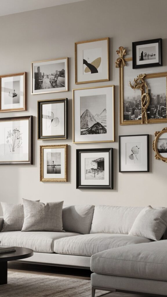
The salon-style picture wall named after the densely hung exhibition walls of 18th and 19th century European art salons is the boldest and most characterful of all picture wall arrangements. Frames of radically different sizes, shapes, and styles cover the wall from low to high, edge to edge, in an arrangement that initially appears organic but is actually governed by careful underlying logic.
When executed well, a salon wall creates a sense of richness, history, and accumulated life that no other wall arrangement can match. It is the interior design equivalent of a well-curated library: impressive through abundance organised with intelligence.
The underlying logic of a salon-style arrangement is horizontal alignment. Despite the apparent chaos of mixed sizes and styles, the most successful salon walls maintain a consistent horizontal line typically the centre line of all frames running across the wall.
This invisible horizontal axis (typically positioned at eye level, around 145–155cm from the floor) means that even as frame sizes vary dramatically, the visual centre of each frame sits at the same height. The result is a composition that feels intentionally designed rather than randomly accumulated, even to viewers who cannot articulate why it works.
Frame variety is what gives a salon wall its personality, but variety without any unifying thread produces genuine visual chaos. The most effective unifying elements for a salon-style arrangement are: a consistent frame colour (all black, all gold, all white, all natural wood) applied to frames of varying sizes and styles; or a consistent mat colour (always warm white or cream, never bright white against coloured walls) applied uniformly across all frames.
“A salon wall is not maximalism for its own sake. It is maximalism in service of storytelling every piece is there because it means something, and together they create a visual autobiography of the person who lives there.”
Either approach allows the frame styles, sizes, and artwork to vary freely while the eye perceives an underlying coherence that makes the whole arrangement feel intentional and considered. The specific challenge of a salon wall that most guides fail to address: what to do when you do not yet have enough pieces.
Starting with a sparse salon wall eight or ten pieces on a large wall always looks like an unfinished gallery wall rather than a deliberate salon arrangement. The critical mass for a convincing salon style typically begins at fifteen pieces and increases from there.
If you are building a salon wall gradually, start with the pieces you have arranged in a tight cluster around a central area of the wall, and allow the arrangement to grow outward over months and years as you add new pieces. A growing salon wall is one of the most satisfying ongoing creative projects in home decoration.
Black and White Photo Walls:
Timeless, Cohesive, and Always Elegant
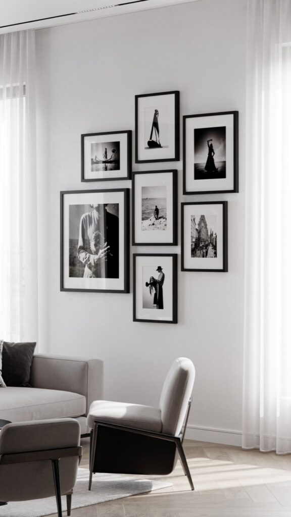
A black and white photo wall is perhaps the single most reliably successful picture wall approach available, and its effectiveness comes directly from the power of monochrome conversion. Any photograph a family portrait taken on a smartphone, a holiday snapshot, a candid moment between friends is immediately elevated when converted to black and white.
The removal of colour eliminates the competing visual noise of mismatched tones and allows the composition, light, and emotion of the photograph itself to dominate. This is why black and white photography is a staple of fine art photography: the limitation forces the viewer’s attention precisely where the photographer intended it.
The practical advantage of a black and white photo wall over a colour photograph wall is cohesion. Colour photographs in a collection almost inevitably clash the orange sunset from Santorini sits uncomfortably next to the green-toned forest from Scotland, which fights with the warm terracotta tones of a Moroccan portrait.
Converting all photographs to black and white resolves every colour conflict simultaneously, producing a collection of images that feel like a unified series rather than a random assortment. This is the primary reason professional interior designers default to black and white photography for photo walls in client projects: it is the fastest route to visual coherence.
Frame selection for a black and white photo wall deserves careful thought. Black frames create a graphic, contemporary quality that references editorial photography and modern gallery aesthetics excellent in minimal, Scandi-influenced interiors. White frames with a cream or warm white mat are softer and more classical, referencing fine art print presentation and traditional gallery hanging.
Natural oak or light wood frames introduce warmth and organic texture that prevents the monochrome photographs from feeling cold. The worst choice for a black and white photo wall is a mix of frame colours: if the photographs themselves are unified, the frames must be too.
Photo Tip: Use Lightroom’s black and white conversion (not simply desaturation) to create rich, tonal monochrome images. Increasing the contrast slightly and lifting the shadows produces the deep blacks and glowing highlights that make printed black and white photographs look genuinely professional on a wall.
Print quality is the invisible variable that separates an impressive black and white photo wall from a disappointing one. Consumer inkjet printing produces images that look acceptable on screen but often lack the tonal depth and crisp detail that make a printed photograph satisfying at close viewing distance.
Professional print services Loxley Colour, Photobox Pro, or WHCC in the US print on calibrated equipment with archival-quality inks and paper, producing images that genuinely reward close examination. The price premium over home printing is typically modest, particularly when prints are being mounted and framed as part of a picture wall that will be seen every day for years.
Mixed Media Picture Walls:
Combining Art, Objects, and Frames for Maximum Depth
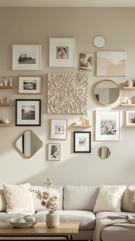
The mixed media picture wall moves beyond the conventional definition of a “picture wall” a collection of framed images and incorporates three-dimensional objects, textiles, mirrors, and other wall-mounted elements into the composition.
This approach produces arrangements with a richness and tactile quality that flat pictures alone cannot achieve, and it is increasingly the preferred approach of contemporary interior designers who want to create genuinely distinctive walls rather than arrangements that look like they could belong in any home. A mixed media wall is, by definition, unique to the person who creates it.
The types of objects that work alongside framed pictures in a mixed media wall are more varied than most people consider. Decorative plates ceramic, vintage, hand-painted introduce circular forms that provide visual relief from the rectangular geometry of standard frames. Woven wall hangings and textile panels add texture and softness in a way that no framed piece replicates.
Mounted antlers, driftwood, or sculptural metal pieces bring three-dimensional depth that creates actual shadows on the wall surface, changing character through the day as light shifts. Small mounted shelves holding objects a single ceramic vase, a small plant, a meaningful keepsake bridge the gap between the wall and the room’s other decorative layers. The compositional challenge in a mixed media wall is more complex than in a standard picture wall precisely because the objects vary so dramatically in form, scale, and visual weight.
The most reliable approach is to treat the mixed media arrangement as a painter would treat a canvas: establish a visual centre of gravity (typically the largest or most visually striking piece), then build outward, balancing visual weight on both sides and at different heights. A heavy, dark object on the left should be balanced by something of equivalent visual weight not necessarily the same physical weight on the right.
Mirrors deserve special mention in the context of mixed media picture walls because they contribute something no other element can: they reflect light and space, making a wall arrangement feel larger and more dynamic than it actually is.
A single decorative mirror incorporated into a picture wall an antique gilt oval, a simple round brass-framed circle, or a faceted sunburst shape doubles the perceived depth of the arrangement while bouncing light around the room. In a darker room or a north-facing hallway, this functional benefit is not merely aesthetic: it genuinely brightens the space in a way that additional lighting often cannot replicate as subtly.
Staircase Picture Walls:
Creating a Dramatic Display on the Most Overlooked Canvas
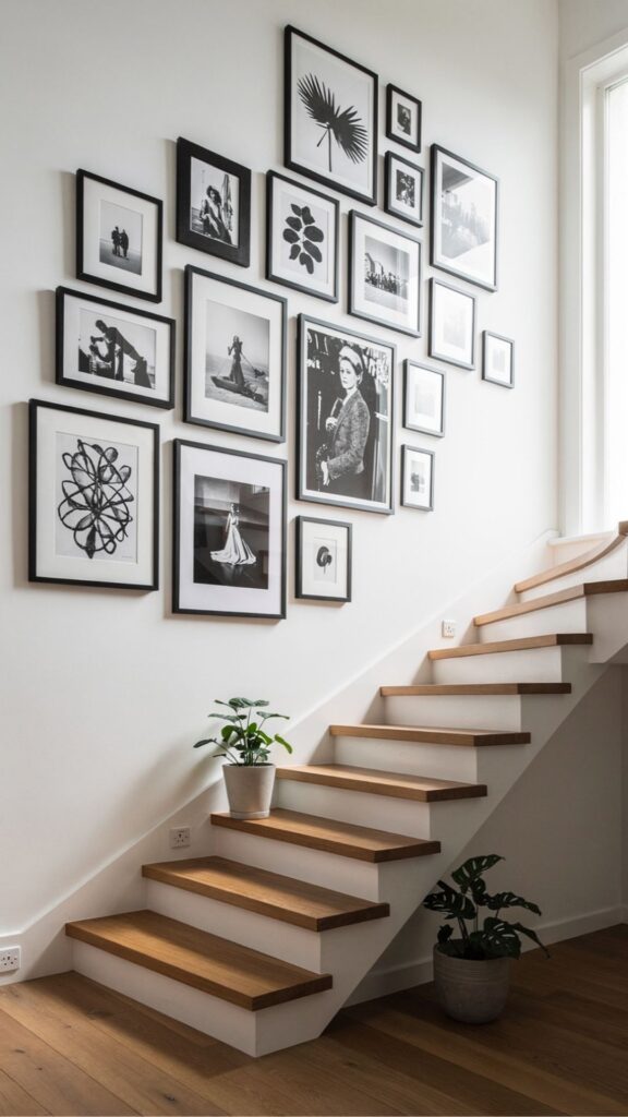
The staircase wall is the most underutilised picture wall location in the majority of homes, and it is arguably the most dramatic and rewarding space in which to create a picture display. Unlike living room and bedroom walls which are viewed primarily from a static seated or standing position the staircase wall is experienced dynamically, from a constantly changing vantage point as you ascend and descend.
This moving perspective means a staircase picture wall reveals itself gradually, offering different compositions and close-up details at each step. It is the only picture wall arrangement in a home that functions almost cinematically. The compositional approach for a staircase picture wall must account for the diagonal line of the stair itself. The most classic approach is to follow the stair rake: the arrangement rises diagonally with the stairs, with the largest piece at the bottom of the flight and progressively smaller or lower pieces ascending with each step.
This approach reinforces the architectural line of the staircase and creates a composition that feels architecturally integrated rather than decoratively applied. An alternative approach a straight horizontal arrangement that runs parallel to the landing level above the stair creates a deliberately counterintuitive tension between the diagonal of the stair and the horizontal of the picture wall, which can be striking in the right interior.
The practical challenge of hanging pictures on a staircase wall is the variable viewing height. A frame that is at perfect eye level from the top landing is positioned at ceiling height when viewed from the bottom of the flight. The working solution is to establish the centre line of the arrangement at eye height from the middle of the staircase run approximately halfway up the flight and build the composition from there.
Install Tip: Use a stair gauge (two adjustable squares clamped to a level) to mark consistent horizontal positions on a sloped staircase wall. Alternatively, cut a cardboard template of your spacing and slide it down the rake as you work it keeps your horizontal gaps consistent even on a diagonal surface.
This ensures that the arrangement is optimally positioned for the point in the stair journey where you are most likely to pause and look at the wall rather than watching your feet. Content selection for a staircase picture wall benefits from a narrative quality a sequence of images that rewards progressive discovery as you move through the space.
A chronological family history (grandparents at the bottom, recent family portraits at the top), a geographical journey (home city at the base, travels culminating at the landing), or a thematic progression (botanical studies of the same plant through different seasons) all work beautifully on a staircase because the ascent itself provides a natural journey structure. This narrative dimension is what elevates a staircase picture wall from a decorative feature into a genuinely memorable interior moment.
Also Read: https://trandyvilla.com/wall-panel-design/
Statement Single Artwork:
When One Powerful Piece Is More Than Enough
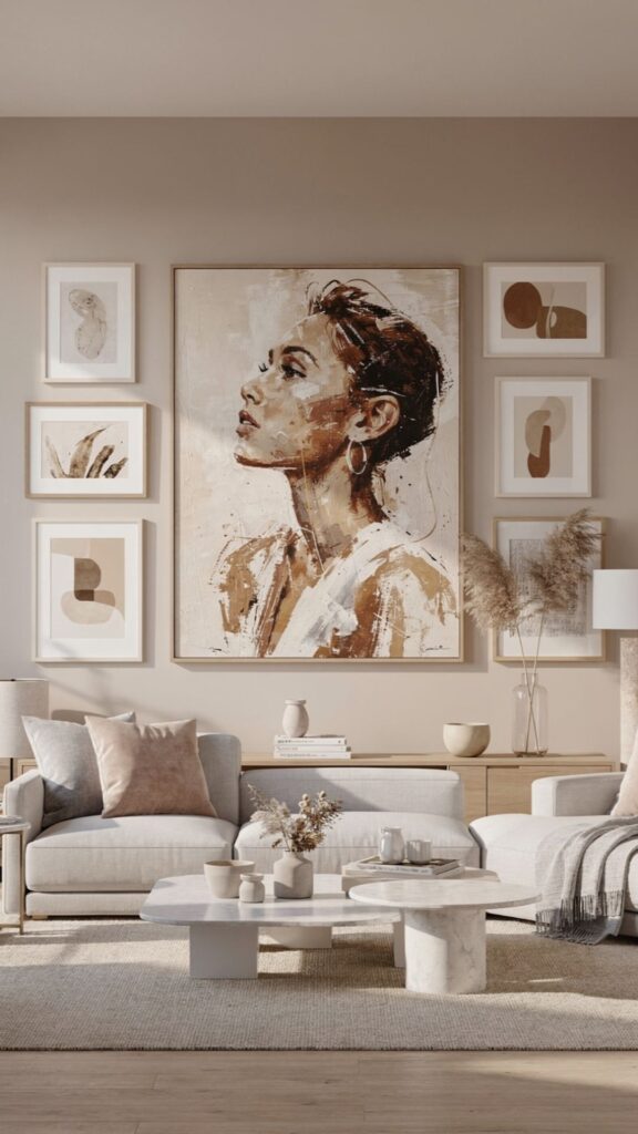
There is a moment in interior design where the instinct to add more more frames, more objects, more arrangement is precisely the wrong impulse. A single large-scale artwork, perfectly sized for its wall and positioned with conviction, can create a more powerful and memorable impression than an entire gallery wall.
This is the principle behind the approach taken in the world’s most celebrated hotel rooms, high-end residential interiors, and architectural publications: one extraordinary piece, given space and light, commands attention and establishes the character of the room without competing with anything.
Scale is the defining variable in statement artwork placement. The single most common mistake when using one piece of art on a large wall is choosing a piece that is too small for the space. A 50x70cm print on a 3-metre-wide wall looks tentative and decoratively timid it fails to establish the visual anchor that a large wall needs.
As a general principle, a single artwork or framed photograph should cover approximately fifty to seventy-five percent of the wall width behind the furniture it accompanies. This proportion sounds bold in theory but consistently looks correct in practice, and it is the ratio used by professional art consultants and interior designers worldwide.
The positioning of a single large artwork requires the same deliberate attention as a full gallery wall arrangement. The centre of the artwork should sit at approximately 145–155cm from the floor standard gallery hanging height rather than centred on the wall height, which typically places the artwork too high for comfortable viewing.
When placing artwork above a sofa or console table, ensure the bottom of the frame sits no higher than 20–25cm above the furniture below. This maintains the visual relationship between the artwork and the furniture that makes the arrangement feel grounded in the room rather than floating independently above it.
“One oversized artwork, well-chosen and correctly scaled, does more for a room than twenty small prints arranged without confidence. Commitment to a single strong piece is always more impressive than hedged multiplicity.”
The content of a statement single artwork carries more weight than in a gallery wall, precisely because nothing else in the arrangement shares the visual burden. Abstract art, in particular, rewards the single statement approach: a large abstract canvas with genuine painterly quality and colour complexity reveals new details and moods as light changes through the day, providing visual interest that a photographic print whose content is fixed cannot replicate over time.
For those building a collection, one significant original artwork is a more rewarding investment than multiple inexpensive prints, both aesthetically and financially. Original art appreciates; mass-produced prints do not.
Floating Shelves as Picture Walls:
Layered, Flexible, and Renter-Friendly
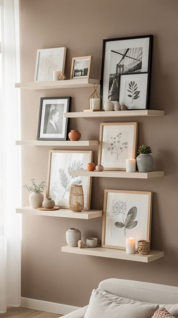
Floating shelves as a picture wall alternative represent the most flexible and reversible approach to displaying art, photographs, and objects on a wall. Rather than hanging frames directly from nails or picture hooks, frames are leaned against the wall on shelf surfaces making them instantly repositionable, easy to swap out, and entirely damage-free when removed.
For renters, the shelf approach is often the only viable route to a considered picture display without risking deposit deductions. For homeowners, the flexibility is simply genuinely useful: a leaned display can be refreshed completely in minutes without a single new hole in the plaster.
The design of the shelves themselves matters more than most picture shelf guides acknowledge. Shallow picture ledges typically 8–12cm deep are specifically designed for leaning frames and are available from IKEA (the MOSSLANDA range), Umbra, and a wide range of independent makers.
The depth is critical: a shelf that is too shallow makes frames unstable and prone to falling; one that is too deep pushes frames away from the wall, creating an awkward forward lean. Shelf colour should relate to the wall colour rather than contrasting sharply with it a shelf that visually recedes into the wall background allows the frames and objects displayed on it to become the focus rather than the shelf itself.
The layering quality of a shelf display where smaller frames lean in front of larger ones, and objects sit in front of frames, creating genuine depth is the defining aesthetic advantage of this approach over wall-hung arrangements. A shelf display has foreground, middle ground, and background in a way that flat wall-hung pictures never achieve.
This spatial depth makes the arrangement feel more like a curated installation than a standard picture wall, and it creates genuine visual interest at close viewing distance that rewards the exploration of individual pieces, objects, and their relationships to each other.
Styling Tip: Odd numbers always work better on picture ledges than even numbers. Three frames of varying sizes look more dynamic than two or four. Add one non-frame object a small plant, a ceramic piece, a stack of books to every shelf to break the pattern and add depth.
The seasonal flexibility of a picture shelf display is an underappreciated advantage that deserves specific mention. Unlike a wall-hung gallery arrangement that requires significant effort and fresh nail holes to refresh, a shelf display can be updated within minutes: swap out summer botanical prints for autumn leaf studies.
Replace holiday photographs with winter still-life images, introduce seasonal decorative objects and remove them without any lasting trace. This mutability means a floating shelf picture wall remains perpetually current and personally relevant in a way that a fixed hanging arrangement, however beautifully designed, cannot match over years of daily viewing.
Kids’ Art Picture Walls:
Celebrating Creativity Without Sacrificing Design
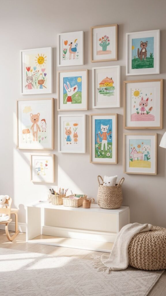
A dedicated kids’ art picture wall is one of the most emotionally meaningful things you can create in a family home and one of the most frequently approached in ways that undermine both the children’s artwork and the room’s design. The instinct to stick drawings directly to the fridge, or to scatter children’s art randomly around the house with tape and magnets, is understandable but does a disservice to both the work and the child.
Framing or displaying children’s art with genuine consideration communicates something profound to the child: that what you create matters, that your work is worth presenting with care, and that your expression is valued as much as the adult artwork in the home.
The most practical and popular system for a children’s art picture wall is a set of clip frames or poster frames typically A3 or A2 size that allow art to be swapped out without damage to the frame. This produces a changing gallery that always displays current work: when a new piece of art comes home from school or from a weekend painting session, it replaces the previous occupant of the frame and the retired piece is either kept in an archive folder or photographed digitally before filing.
This rotating display approach means the picture wall remains genuinely current and prevents the accumulation clutter that children’s art can otherwise create. Design considerations for a kids’ art picture wall are the same as for any other picture wall, and should be taken equally seriously. A consistent frame style all identical white clip frames, for example, or all natural wood unifies works that vary dramatically in style, colour, and subject.
Positioning matters: the display should be at the child’s eye level, not adult eye level, so that the child actually interacts with and takes pride in it rather than simply knowing it exists somewhere near the ceiling. A dedicated wall in a playroom, bedroom, or corridor specifically for the child’s work gives them genuine ownership of a space in the home.
Parent Tip: Photograph every piece before rotating it out of the frame and save to a digital album “Year 1 Art,” “Year 2 Art,” etc. This creates a remarkable record of your child’s creative development over time, and the archive itself becomes a treasured keepsake that the framed display alone cannot provide.
A more advanced approach for families who want a genuinely design-led kids’ art display is the tension wire system: horizontal steel cables stretched between wall-mounted brackets, with small clips suspending artwork from the wires.
This approach used in progressive school environments and Montessori settings allows maximum flexibility in arrangement and number of pieces, easy swapping without any frame removal, and a clean, contemporary aesthetic that holds its own in a design-conscious interior. Combined with good directional lighting, a tension wire art display can look genuinely gallery-quality while remaining entirely child-accessible and regularly updated.
Symmetrical arrangements on either side of a central focal point work particularly well on a headboard wall because they reference the inherent symmetry of a bed and reinforce the restful, ordered quality that a bedroom should project.
Two identical bedside tables flanked by two matching pendant lights, with a symmetrical arrangement of matching frames above the bed, creates a composition of great visual calm everything is balanced, nothing is competing, and the eye settles naturally. This is in direct contrast to the more dynamic, asymmetric arrangements that work well in living spaces where energy and visual interest are appropriate qualities.
Content selection for a bedroom picture wall should be actively considered from a psychological perspective. The bedroom is the last thing you see before sleeping and the first thing you see on waking which means the imagery in the room has a disproportionate effect on mood and mental state at vulnerable moments.
Calming, beautiful imagery landscapes, botanical studies, abstract works in muted palettes, intimate family photographs supports the restful function of the bedroom in a way that busy, complex, or emotionally charged imagery does not. This is not mere sentiment: sleep researchers and environmental psychologists consistently note the effect of visual environment on sleep quality and morning mood.
The physical scale of a headboard wall arrangement relative to the bed is critical to its visual success. A narrow strip of small frames above a king-size bed looks proportionally wrong the arrangement appears trivial in relation to the large horizontal mass of the bed frame and mattress below it.
As a guide, the total width of the picture arrangement should be at least two-thirds of the width of the bed, and the arrangement should extend to a height of at least 60–80cm above the headboard or pillows. This creates a wall composition that holds its own visual weight against the bed and integrates the furniture and the wall decoration into a single, considered design statement.
Minimalist Picture Wall:
When Restraint Creates More Impact Than Abundance
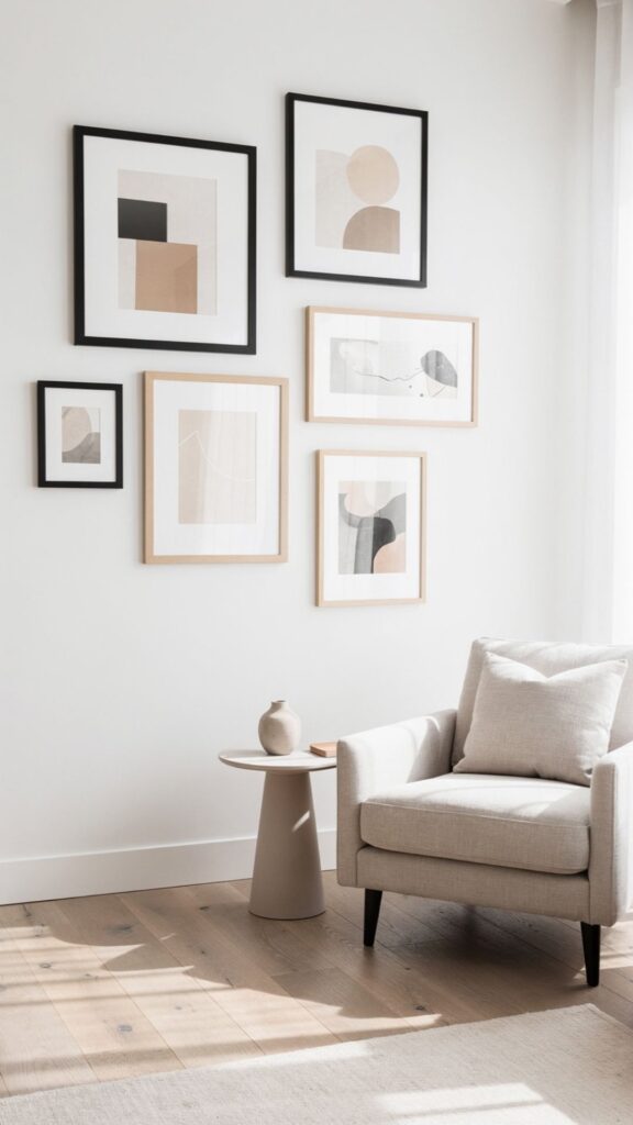
The minimalist picture wall is the most demanding of all picture wall approaches precisely because it relies entirely on the quality of individual pieces rather than the cumulative impact of many. In a gallery wall of twenty pieces, a weaker image is diluted by the surrounding work. In a minimalist arrangement of three to five pieces, every single frame is fully visible and must stand entirely on its own merits.
This is why the minimalist picture wall requires more confidence, more selectivity, and more willingness to invest in fewer, better pieces than any other approach. The standard of execution must be higher because there is nowhere to hide.
The spatial relationships between pieces in a minimalist picture wall are as important as the pieces themselves perhaps more so. The distance between two framed prints in a minimal arrangement is not empty space: it is negative space that gives each piece room to breathe and be fully appreciated. This is the principle that Japanese aesthetics call ma the productive pause, the meaningful interval.
A minimalist picture arrangement that places two related but distinct artworks 40–50cm apart, on an otherwise clear wall, invites the viewer to consider the relationship between the two pieces and the meaning of the space between them. This level of viewing engagement is impossible in a densely hung gallery arrangement.
Frame choice in a minimalist picture wall carries enormous weight because each frame is fully visible and has no neighbouring pieces to contextualise it. The most successful minimalist frame choices are either completely invisible a near-frameless float mount that lets the artwork extend to the very edge of the print or deliberately architectural: a deep.
Wide-profile frame in natural oak or matte black that gives the artwork a presence and gravity that a standard thin frame cannot provide. The mat (the card mount within the frame) should be generous wider than standard to give the artwork within it maximum breathing room and visual importance.
Curation Tip: For a minimalist picture wall, apply the “museum test”: would this piece be considered strong enough to hang alone in a professional gallery context? If the honest answer is no, the piece is not right for a minimalist arrangement. Save it for a busier gallery wall where it can contribute to a collective effect.
The minimalist picture wall is particularly powerful in spaces where design restraint is already the prevailing aesthetic: a modern Scandinavian-influenced living room, a Japanese-inspired bedroom, a white-painted architectural hallway. In these environments, a single large-format photograph or a pair of related botanical studies on an otherwise bare wall feel absolutely correct the picture wall and the interior are in genuine dialogue.
Each reinforcing the other’s clarity and intention. In a more decoratively busy interior, the minimalist approach can feel merely incomplete rather than deliberately restrained context always determines whether minimalism reads as intentional or unfinished.
Check More idea: https://trandyvilla.com/staircase-wall-design/
Budget Picture Wall Ideas:
Creating a Stunning Display for Less
A beautifully designed picture wall does not require significant financial investment it requires intelligent sourcing, creative thinking, and the willingness to treat inexpensive materials with the same deliberateness you would apply to premium ones.
Some of the most impressive picture walls in genuinely well-designed homes have been assembled almost entirely from budget sources: IKEA frames, printed photographs, images downloaded from free art platforms, and objects sourced from charity shops and flea markets. The quality of the curation and the care of the arrangement matter infinitely more than the cost of the individual components.
Free art prints are a significantly underused resource for budget picture walls. Museums and cultural institutions that hold expired copyright art the Metropolitan Museum of Art in New York, the Rijksmuseum in Amsterdam, the Art Institute of Chicago offer high-resolution digital downloads of their collections freely and legally through their open access programmes.
This means you can download, print, and frame museum-quality Old Master paintings, botanical illustrations, Japanese woodblock prints, and architectural drawings for the cost of the print and frame alone. A gallery wall of expertly curated, museum-sourced free art prints in consistent frames is visually indistinguishable from an expensive art collection to any but the most informed eye.
IKEA frames particularly the RIBBA and HOVSTA ranges represent genuinely excellent value for money in a picture wall context and deserve recognition beyond their reputation as merely functional. The RIBBA frame’s wide white mat, when used consistently across a grid or gallery arrangement, produces an arrangement that reads as professional and considered regardless of the content inside.
Using identical RIBBA frames throughout a picture wall creates the visual unity that holds any arrangement together, and their affordability makes large-scale arrangements twelve or fifteen frames financially achievable for anyone. The frames themselves are not remarkable; used consistently and deliberately, they absolutely are.
Budget Tip: Photograph your existing collection of meaningful objects shells, pressed flowers, ticket stubs, leaves, fabric swatches and print them as A4 or A3 images. These personally meaningful, visually simple images make beautiful, completely unique prints that cost pennies and tell your story far more authentically than purchased art.
Charity shops, car boot sales, and online secondhand marketplaces (Vinted, Facebook Marketplace, eBay) are consistently underexplored sources of picture wall material. Vintage frames particularly ornate gilt frames of the sort that were once standard in traditional British homes are available in abundance and can be purchased for a fraction of their original cost.
The trick is to look past the print or painting already in the frame: the frame itself, repainted in chalk paint or left in its original gilded state and hung empty or with a new image, becomes a characterful and distinctive picture wall component that no amount of budget shopping at new retailers can replicate. The hunt itself is part of the experience.
Final Thoughts:
Your Picture Wall, Your Story
Picture wall ideas, in all their forms from the organic gallery wall to the precise symmetrical grid, from the maximalist salon arrangement to the restrained minimalist display share a single underlying purpose: to make the walls of your home reflect the life, taste, and personality of the person who lives there.
There is no objectively correct approach, no single right answer. The right picture wall is the one that means something to you and is executed with genuine care and intention. The key takeaway is simple: start with what you love, not with what looks good on Pinterest.
A picture wall built around images and objects that are genuinely meaningful to you will always be more beautiful than one assembled from aspirational references because authenticity and personal meaning are qualities that translate directly into the emotional impact of a space, in ways that perfect styling cannot manufacture.
Choose one idea from this guide, gather the frames and prints you already have, and begin this weekend. The first nail is always the hardest everything after it is discovery.

Sereen Khan is a passionate home decor writer and creative mind behind Trandy Villa, where style meets comfort in everyday living. She loves turning simple spaces into beautiful, functional homes using smart ideas, budget-friendly hacks, and modern design trends.


